The Brief
In the fall of 2013 the team at the Children's Hospital of Philadelphia could see that half of their site traffic was coming from mobile devices so they began lobbying for a mobile-first redesign. They needed an experienced partner, and since my firm had recently worked on some similar projects, we were chosen to develop their new CMS and responsive design system.
The Process
The project began with a week of onsite discovery meetings to gather as much information as possible about what the client was hoping to achieve and to ensure a good outcome. Toward this end we collaborated on activities such as I Like, I Wish, I Wonder… that help identify pain-points and gaps in the current system, and some nice-to-have’s for the new one. Throughout the week we do other similar activities to further narrow in on project goals and level-set expectations. Inclusiveness is the key during this process so all parties feel consulted, and comfortable about the direction of the project.
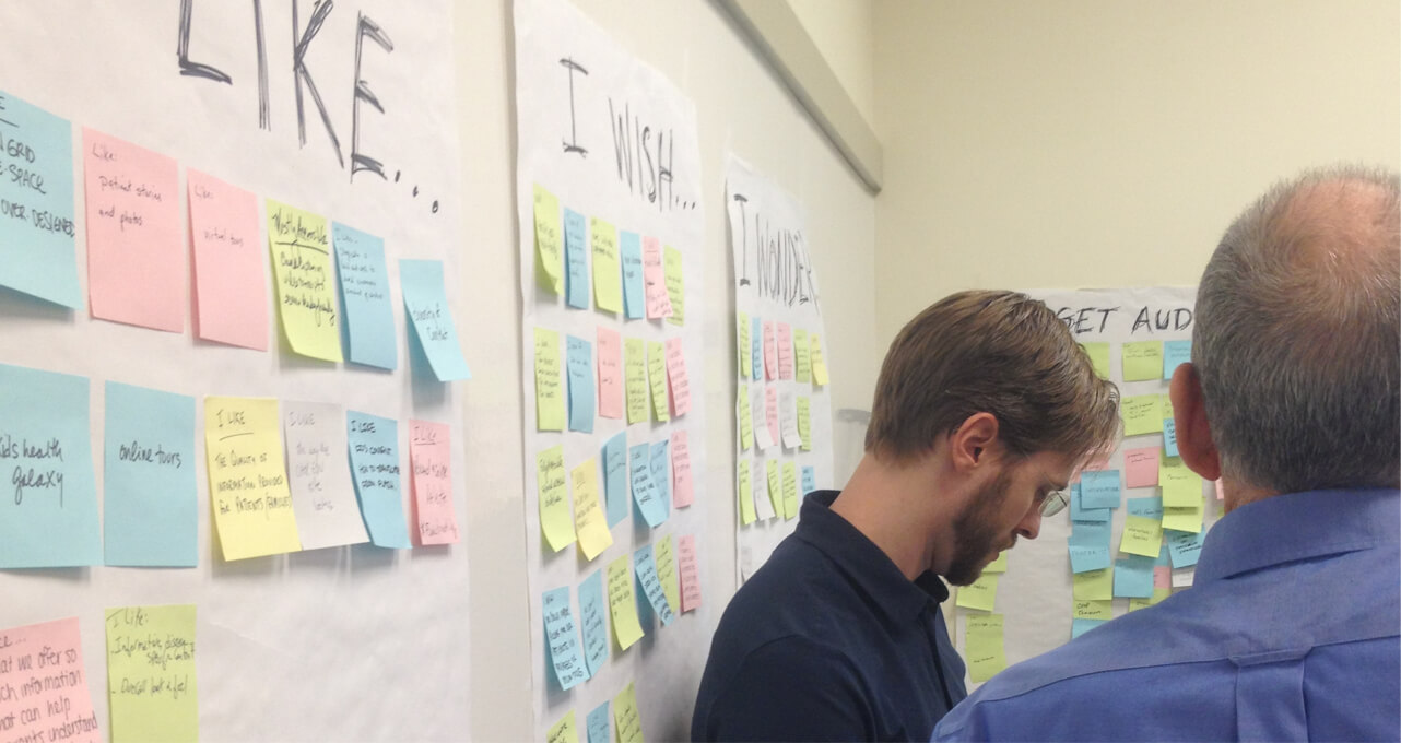
One of the biggest takeaways from our meetings with the CHOP team was that they very much wanted to be trained in our tools, processes, and techniques in order to maintain and expand the site after we parted ways. So we thought it would be a good idea for their interactive design manager to co-locate with me for a week early on in the design process. This way we could collaborate to get the ball rolling, and he could learn how to approach design in a modular and systematic way suited to large responsive sites. He could then transfer that experience to his own team once the project had gained some momentum.
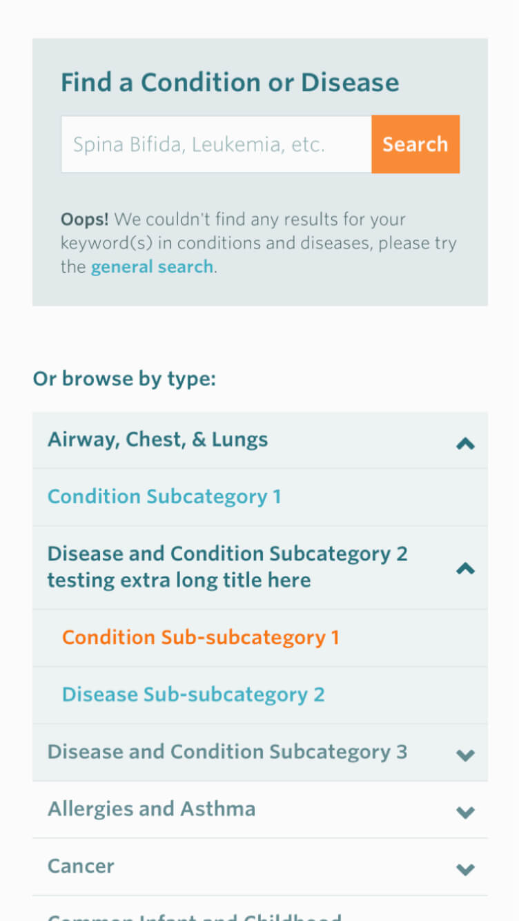
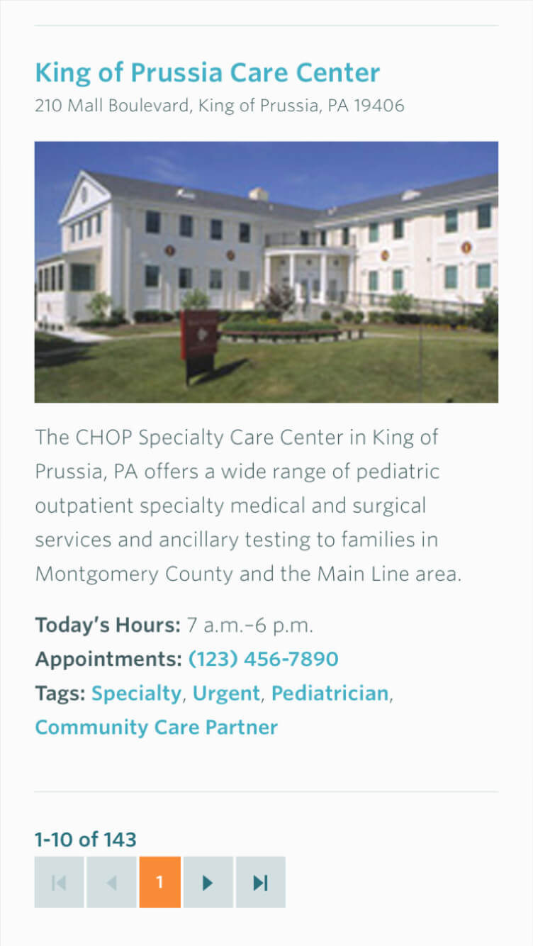
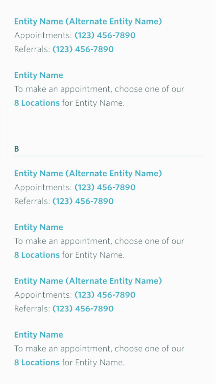
As other teams focused on a content survey and the deciding on the big buckets that would become the major sections of the site, we began identifying content types and page templates. This took the form of a lot of whiteboard sketches which started with lists of the most important information that describe a specific piece of content like a location, doctor, or condition.
After a few pages began to take shape we could identify things that were being repeated, called components, and use them to create additional pages. The sketches were then refined and combined into more general templates that would form the basis of the new site.
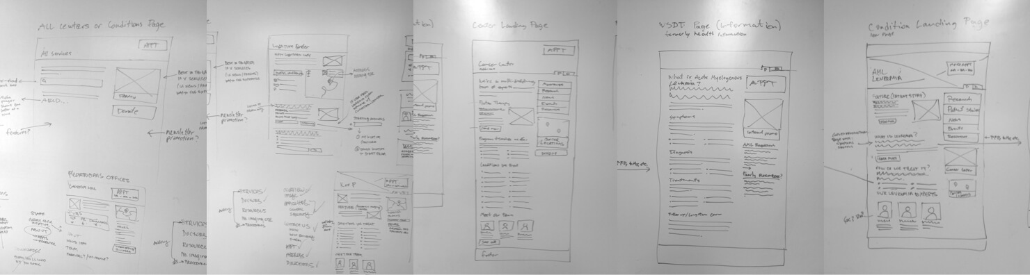
Next the sketches were firmed up into wireframes with a static design tool. The goal here was to be visually rough and fast, but with enough detailed information to communicate important ideas, facilitate conversations, and get the go-ahead for design and development.
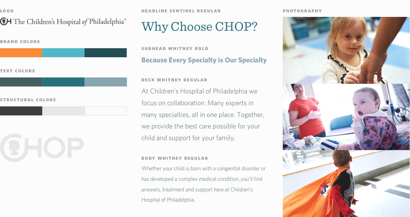
At about the same time as the wireframing I was beginning to explore some ideas for visual look-and-feel. I used a technique called a style tile which combines a logo, some colors, photos, and type into a format that doesn't resemble a web page. This is a great way to get buy-in on a design direction without getting mired in hypothetical details. I chose hopeful inspiring photos, bright electric colors with a main hue reminiscent of hospital scrubs, and a modern playful type-pairing.
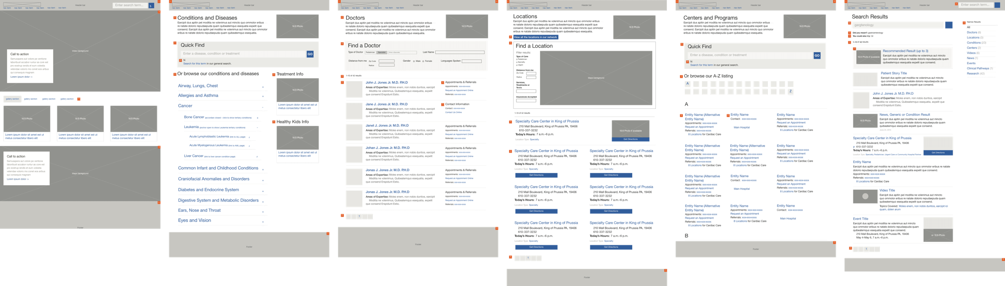
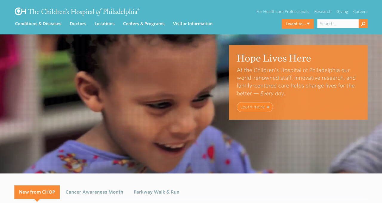
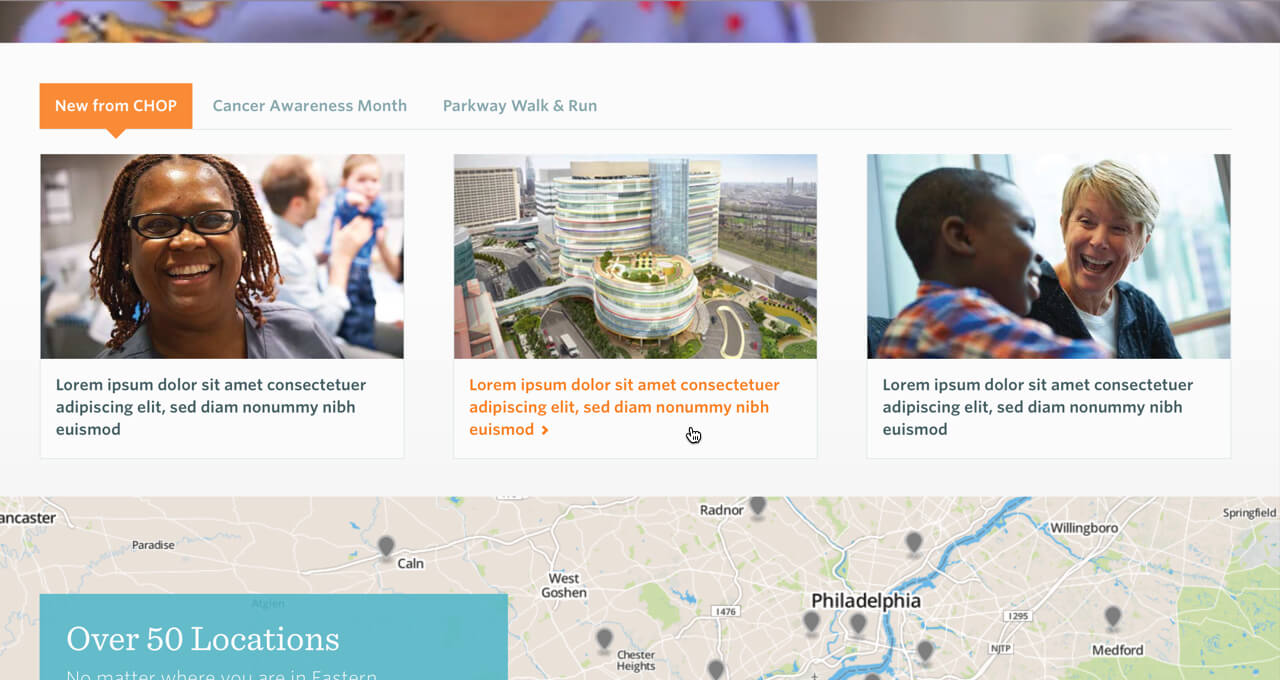
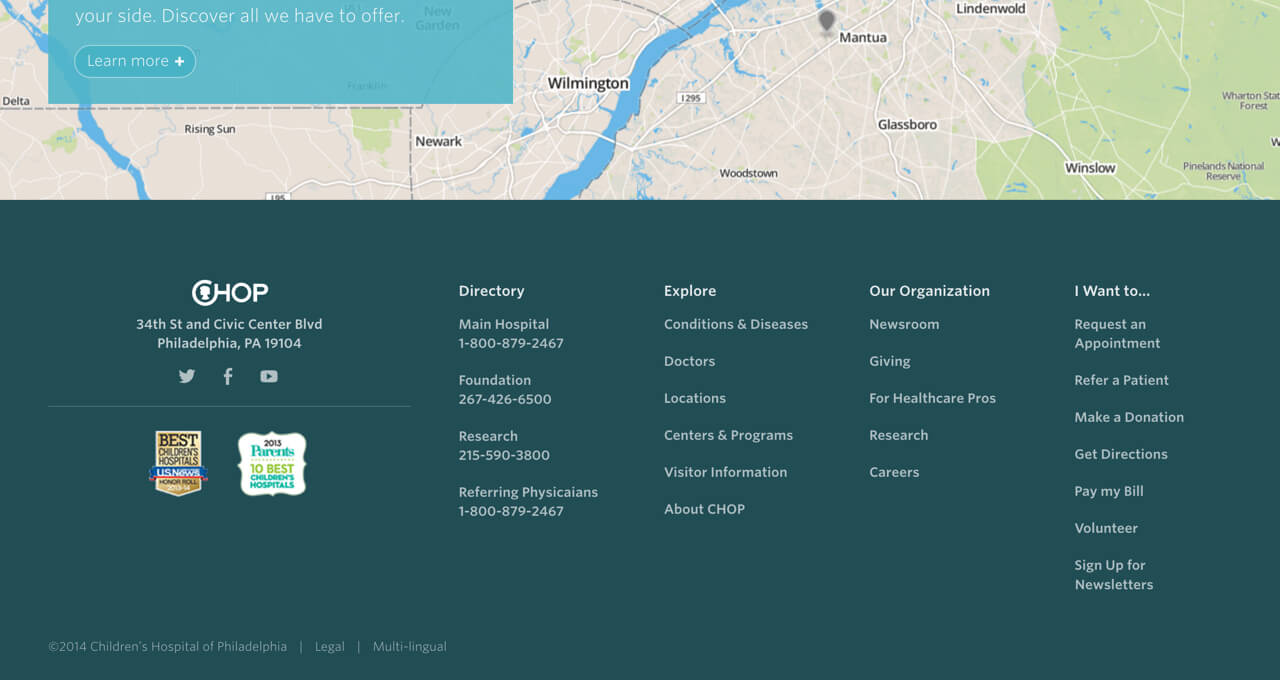
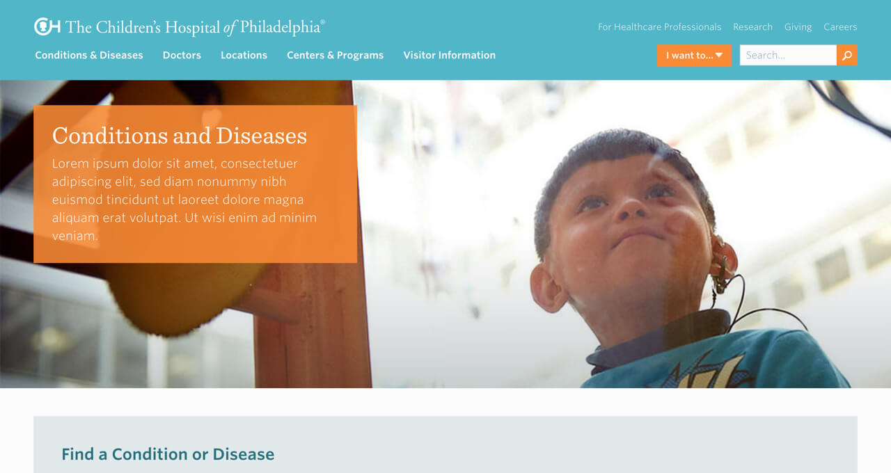
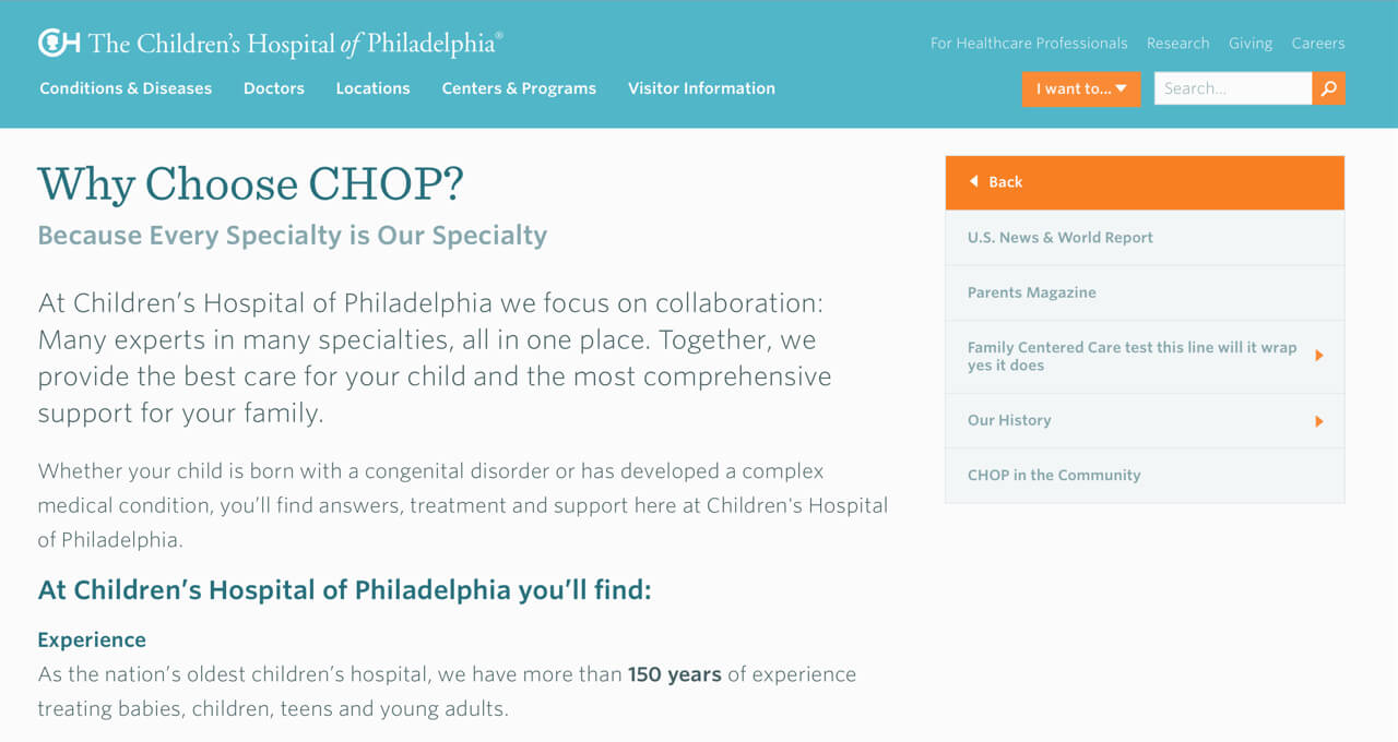
From here I created the core set of templates in the browser with HTML and Sass. The templates I chose to start with were the homepage, general page, a few unique but related landing pages, and a search results page. Once the templates were done, I worked up a quick style guide that showed many of the components extracted from the templates. As it turns out, being able to see the parts and pieces of the site in isolation helped the client better understand how to recombine components to create new pages once they were on their own — one of their top success metrics!
The Result
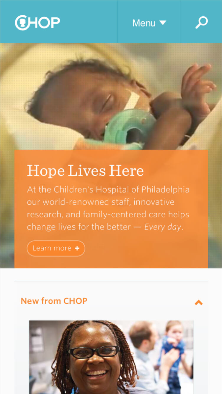
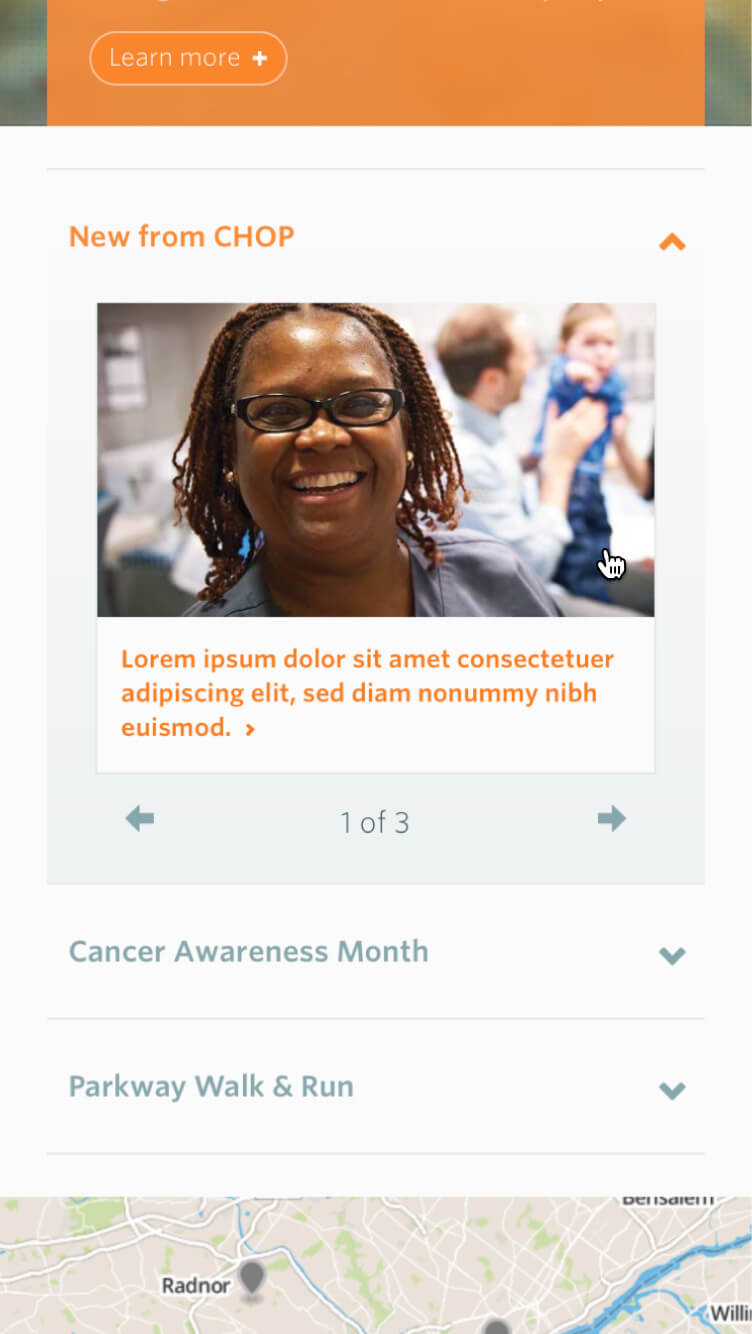
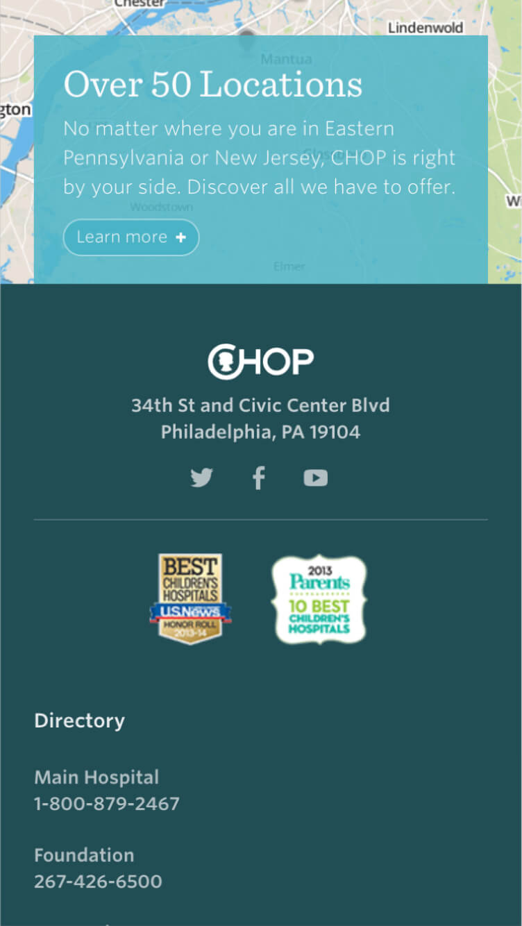
See how design elements and components combine to create visually harmonious templates in the screenshots below.
More about this project
Check out the RWD podcast with Ethan Marcotte and Karen McGrane below for more insight into how a mobile-first approach and design system thinking can change a team's culture.