Design systems
In simple terms, design systems are a kit of reusable parts, pieces, and standards that can be used to more efficiently build and scale digital products.
Companies such as Google, Salesforce, Shopify, and Github have all invested in their own systems due to the many benefits a well-made design system can provide a product organization. Here are a few:
- Increased cross-discipline alignment
- Increased design consistency
- Faster prototyping and iteration
- Reduced technical and design debt
- Increased scalability
- Increased usability
- More effective new employee training
Basis Design System
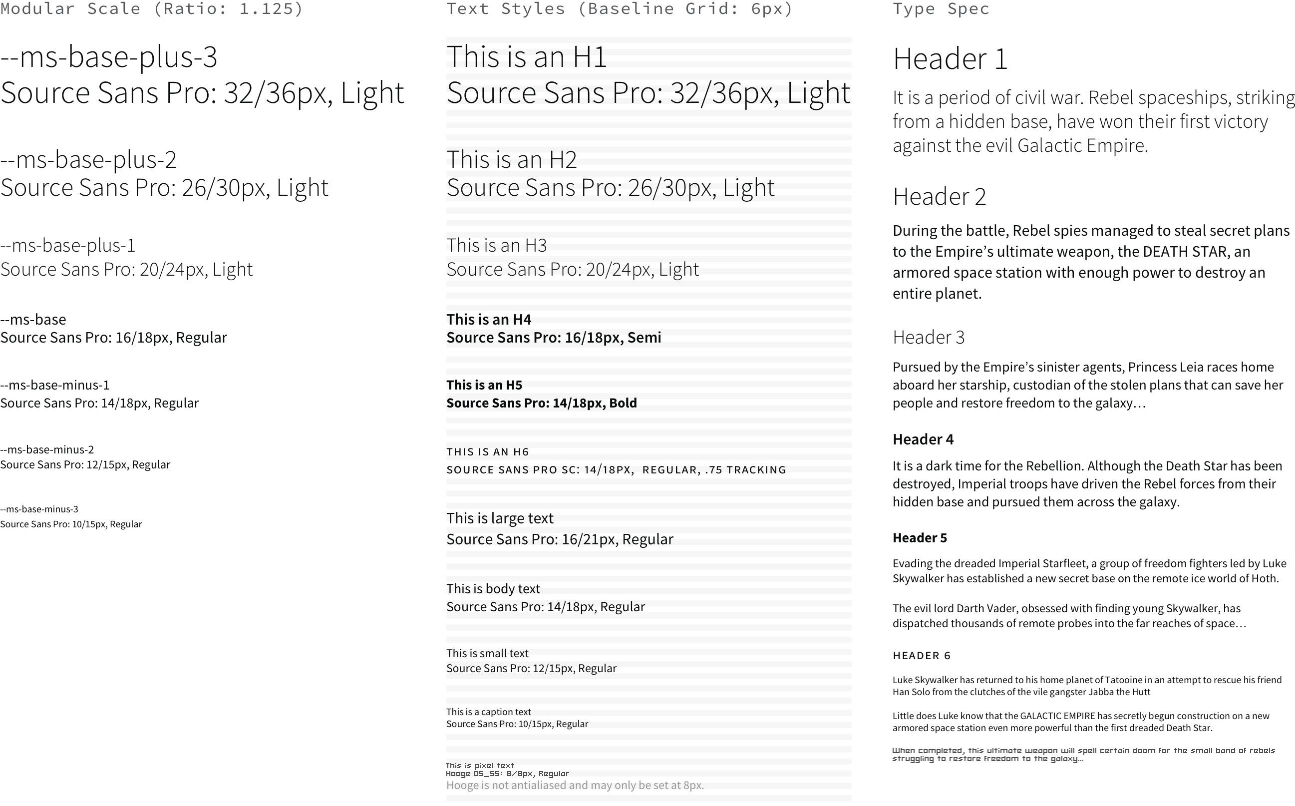
Our design system began with the typeface first. Source Sans Pro was chosen because it's a free Google Font with a narrow set-width and a large x-height, making it readable at smaller sizes. These attributes also allowed for more characters to fit in any given horizontal space, supporting a data-heavy app.
A modular scale of 1.125 with a base size of 14px was used. Body text is regular weight, while headings are bold, shifting to light at display sizes. This is because other weights of Source Sans do not fare well at large sizes and there is no display font available.
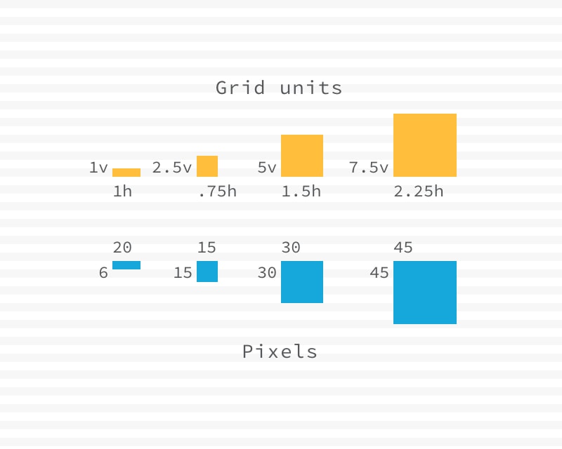
To find visual harmony, the vertical unit of measure was derived from the baseline grid of six pixels. The horizontal unit was taken from the gutter width of 20 pixels. A square dimension can be achieved by using half- and quarter-values. These values are included in the app's CSS and provide modular sizing and spacing values.
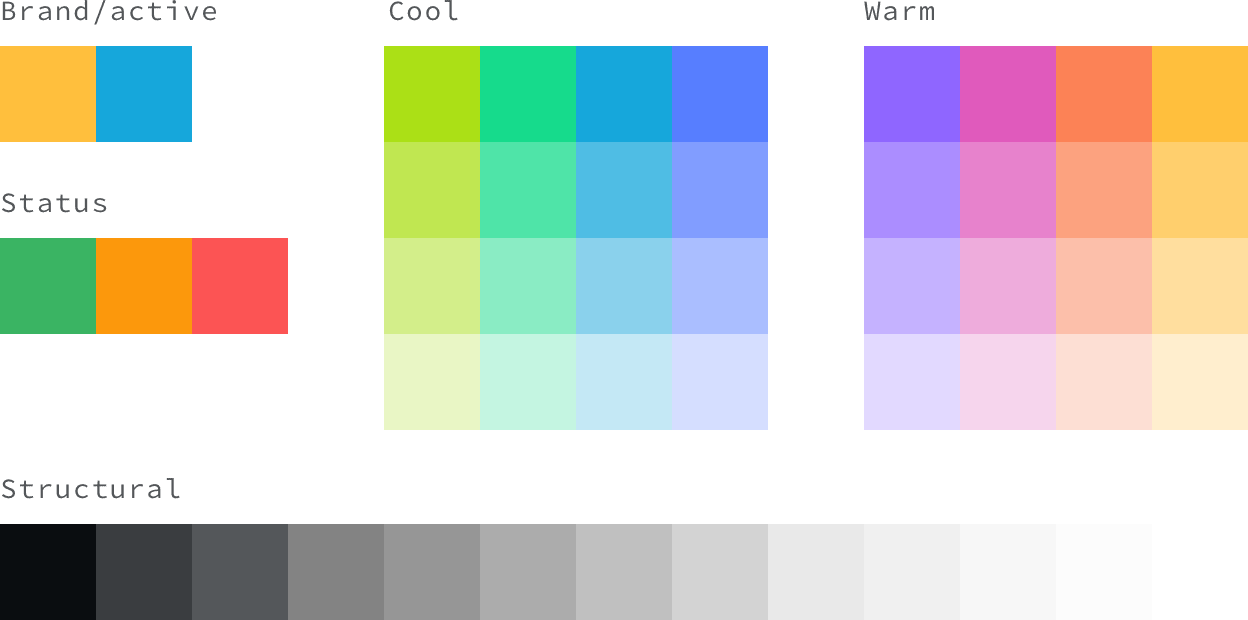
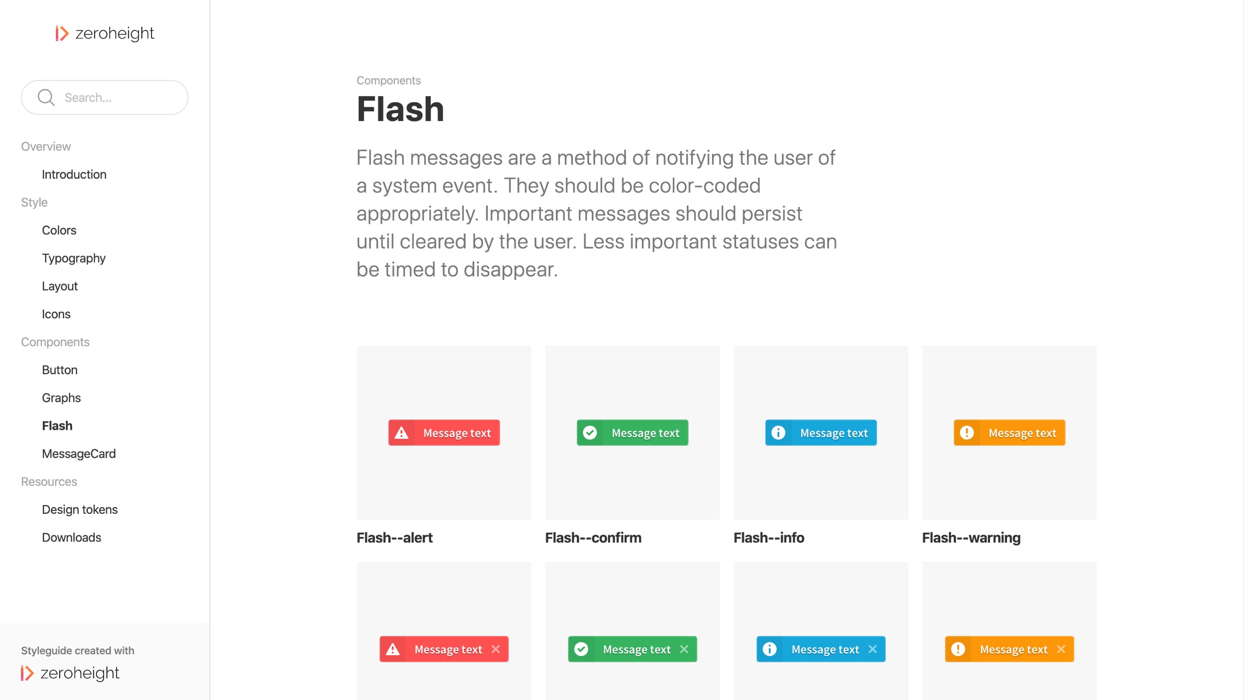
The color palette began with the brand-gold and active-blue and was then expanded to support data visualization. The trick there was to surround the brand and active colors with hues that were visually distinct but equally vibrant, while avoiding the colors reserved to relay app status: green for confirm, orange for warning, and red for error. Lastly, a monochromatic gray scale was included for page structure.
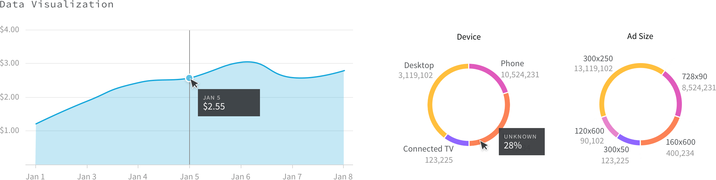
You can see the extended color palette at work above in the data visualization example. These were built with Recharts.js and includes bar, line, area, and pie graphs. Some great functionality like scrubbing and responsive resizing are included out of the box.
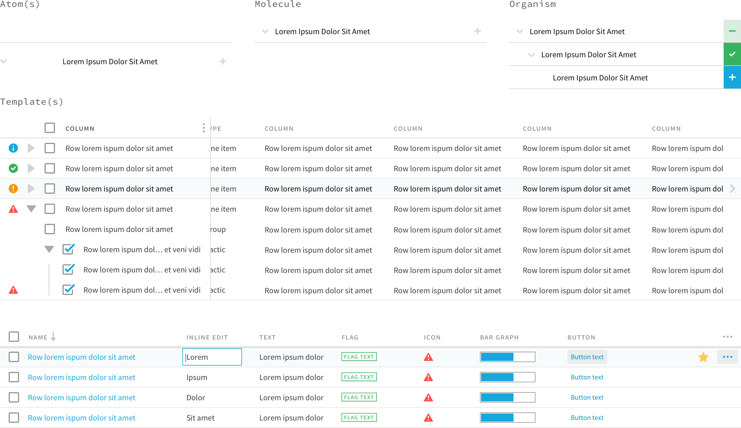
In atomic design principle, the smallest repeatable, unbreakable parts are known as atoms. Atoms may be assembled to create molecules. Molecules and atoms can be put together to create organisms. Atoms, molecules, and organisms can be put together to create more complex templates and pages. This nested hierarchy is easy to see in the following examples from Basis UI.
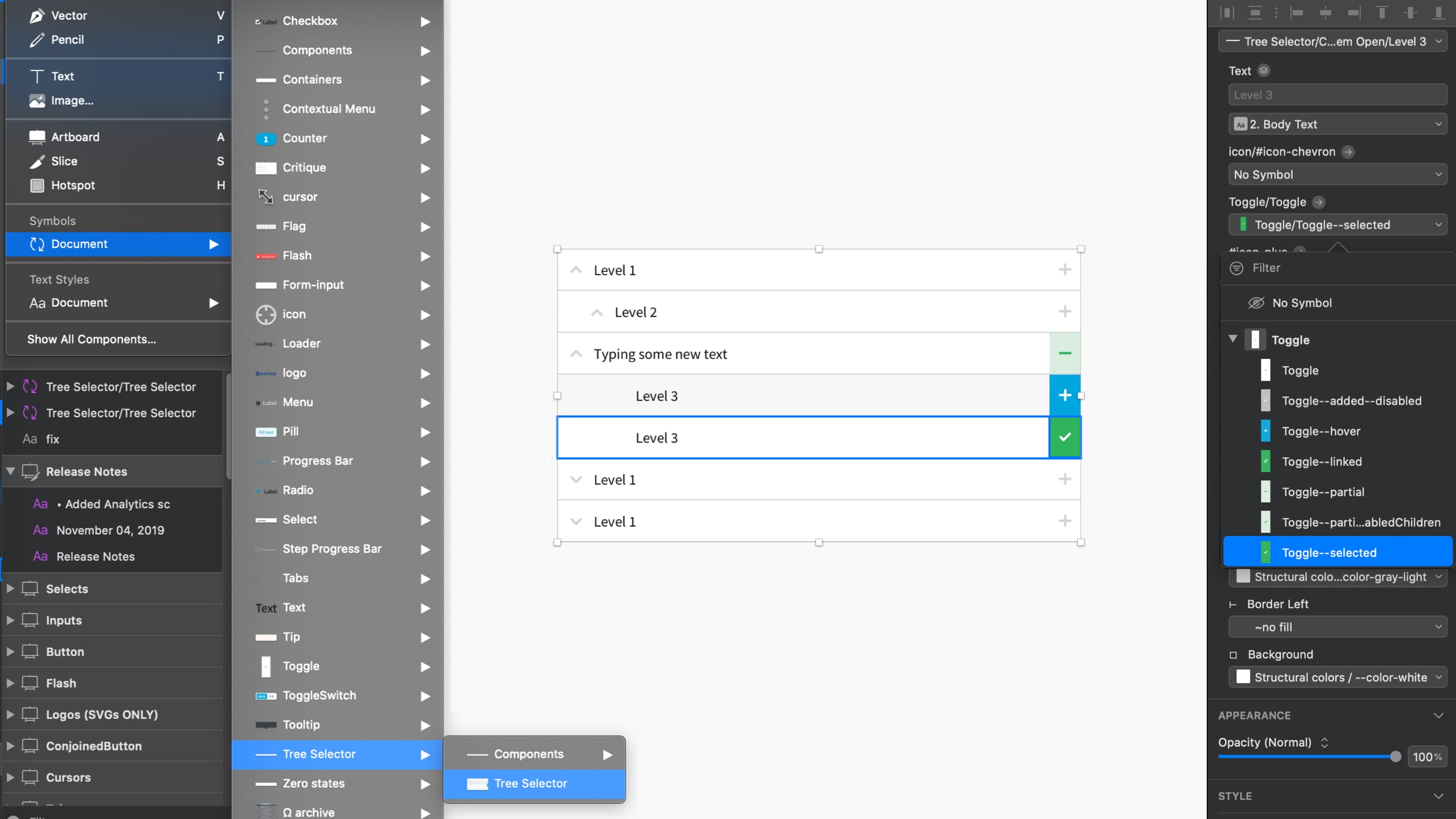
In Sketch, atomic design is expressed as nested symbols. Symbols can accept responsive resizing instructions and contain any number of symbols inside them. Symbols of the same size can be swapped out in the right-hand palette (below). Text can also be overridden, meaning that state can now more easily be shown in a design comp. Removing some of the manual work from the equation allows teams to work faster and more accurately.
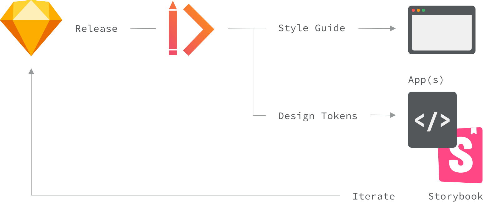
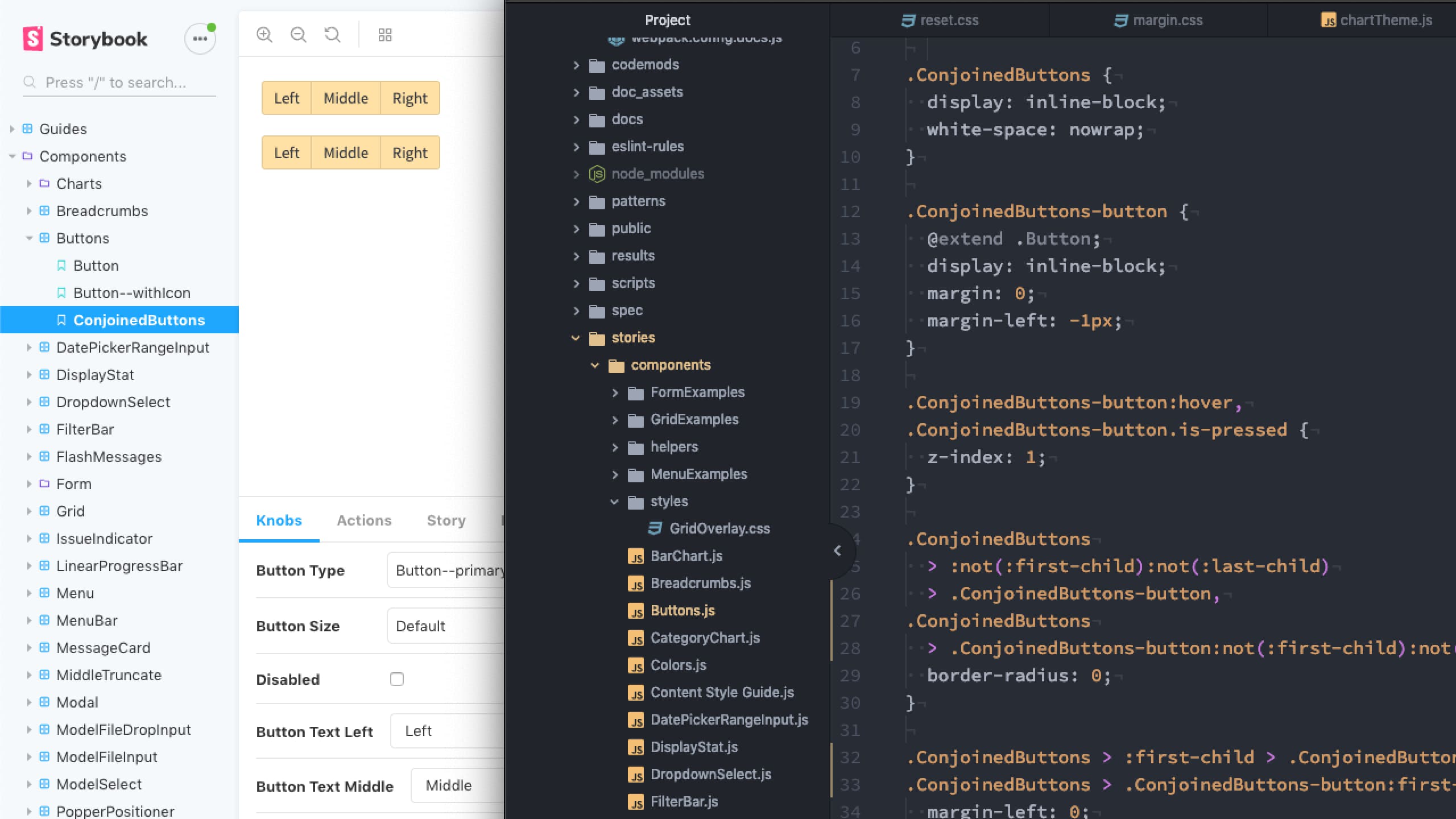
The best design system will fail if nobody knows about it. Some tools that can help you communicate your system to the wider product org are Storybook and Zeroheight. Storybook is a dev tool that allows React components to be worked on in isolation of the wider application. Since it lives alongside your JS and CSS, it's possible to mock up live components. At Centro I used this tool to troubleshoot UI issues and it was great way to interface with developers.
Zeroheight is a design tool that imports your Sketch assets and create a publicly available web style guide. This also is a great opportunity to add documentation about when and how to use a component since Storybook tends to be less visible and a place for work work in progress. It also provides design tokens in the form of Sass, CSS, Less, JSON, iOS, and Android.
CSS for Systems
Design tokens are like design “atoms” for a codebase because the principle is the same: the smallest, repeatable, unbreakable element. In code, if you want to repeat something many places a variable is used. Variables should be namespaced so they are organized and easy to understand. A color variable is perfect example: --color-lime: #ABE016;, --color-berry: #E05ABC;, etc.
Simply declaring design tokens alone is not enough for robust systems. We also need to assign intent. Let's make the brand color our berry variable: --color-brand: var(--color-berry);. Nesting variables this way allows us to manage future changes more easily. Let's say our company rebrands and we need to update. Even if --color-brand is used 500 times in 50 components, we only need to change it in one place: --color-brand: var(--color-lime);.
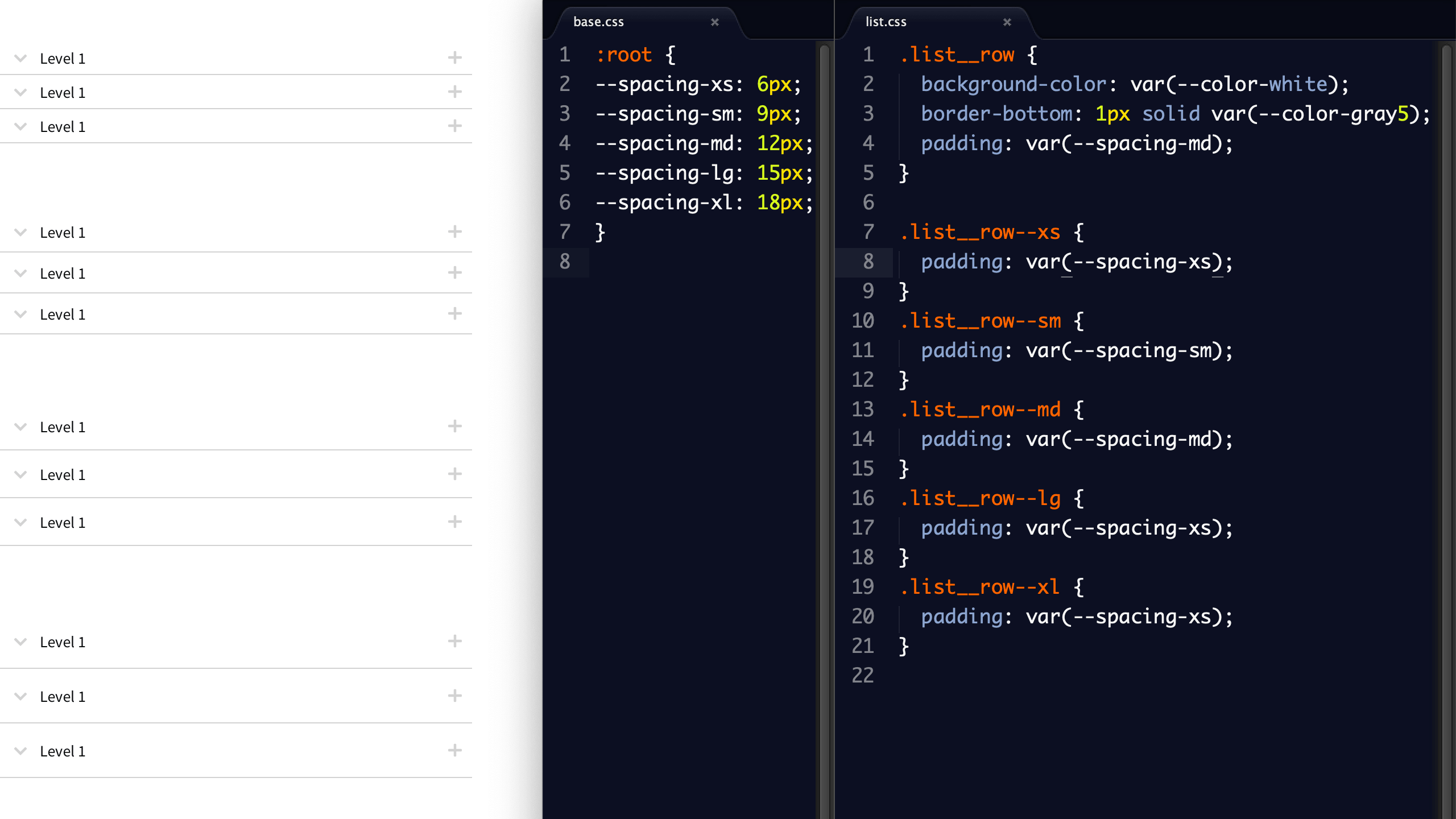
Another way to take advantage of variables in your design system is to create a scale of values that would get used many times. For example, spacing. Let's say our baseline grid is 6px and we want to create a harmonious set of options for everyone to use: 6, 9, 12, 15, 18. T-shirt sizes are something everyone can relate to so let's go with xs, sm, md, lg, xl. Proper variable naming will get you this: --spacing-md: 12px;. Now let's adjust the density of our Basis list molecule from earlier:
Putting it all together
In addition to maintaining the system in your design tools, any changes you make need to inherit downstream to any number of things. For example, you may have a React web app, Storybook, a native app, a style guide, and a marketing website. That's a lot to manage manually and it introduces a lot of opportunity for drift. Luckily there are tools like Invision DSM and Zeroheight that can automate some things, but the heavy lifting is done with maintainable and scalable CSS, a solid process, and a dedicated cross-discipline team.