Problem
Mapping is a function in Basis where ad performance data from third-parties is pulled into the application so it can be associated with different line items in a campaign.
“Right now, there are three ways to map creative and delivery for reporting. When we build out tactics, we have to attach ad tags within the tactic. Then, we have to go to the Creative screen and ‘map’ the creatives to the tactics. Then, in reporting, we have to go to the Actions screen in Analytics and ‘map’ delivery by tactic. My question is... why don't these three functions speak to each other more efficiently?”
Research
We began our research by interviewing four people who dealt with mapping regularly as part of their role, including two in relevant leadership positions:
- Media Specialist — builds campaigns, interfaces with AdOps
- AdOps Specialist — connects campaigns to data sources, QA's data
- AdOps Manager — manages team, enforces process/standards
- AdOps Director — develops process/standards
We interviewed each person for about 30 minutes, screen-sharing the current mapping screen and asking very general questions so we could uncover insights about the workflow that we weren't already aware of.
- “Can you walk me through how you map today?”
- “How do you know which data source goes with which line item?”
- “How do you know when to start mapping?”
- “How do you know something has been successfully mapped?”
- “How do you know when you're done mapping?”
- “How do you know when there's an issue with a data source?”
- “What happens if something is mapped incorrectly?”
- “How often do errors happen?”
- “How many data sources could there be in a large campaign?”
Top Findings
Our conversations produced some interesting and actionable insights as well as validating some assumptions we had going in. If multiple people mentioned the same pain point, we knew there was added merit to addressing the concern.
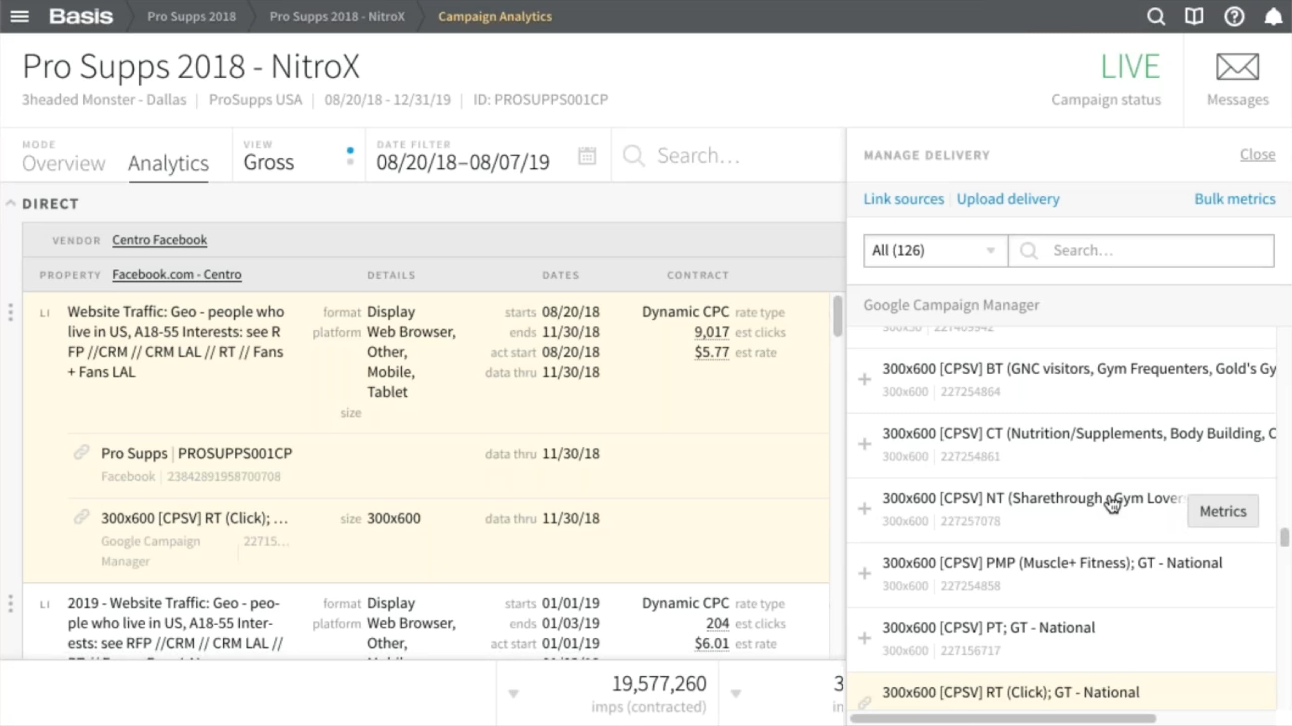
- There can be up to 800 data sources in a single campaign!
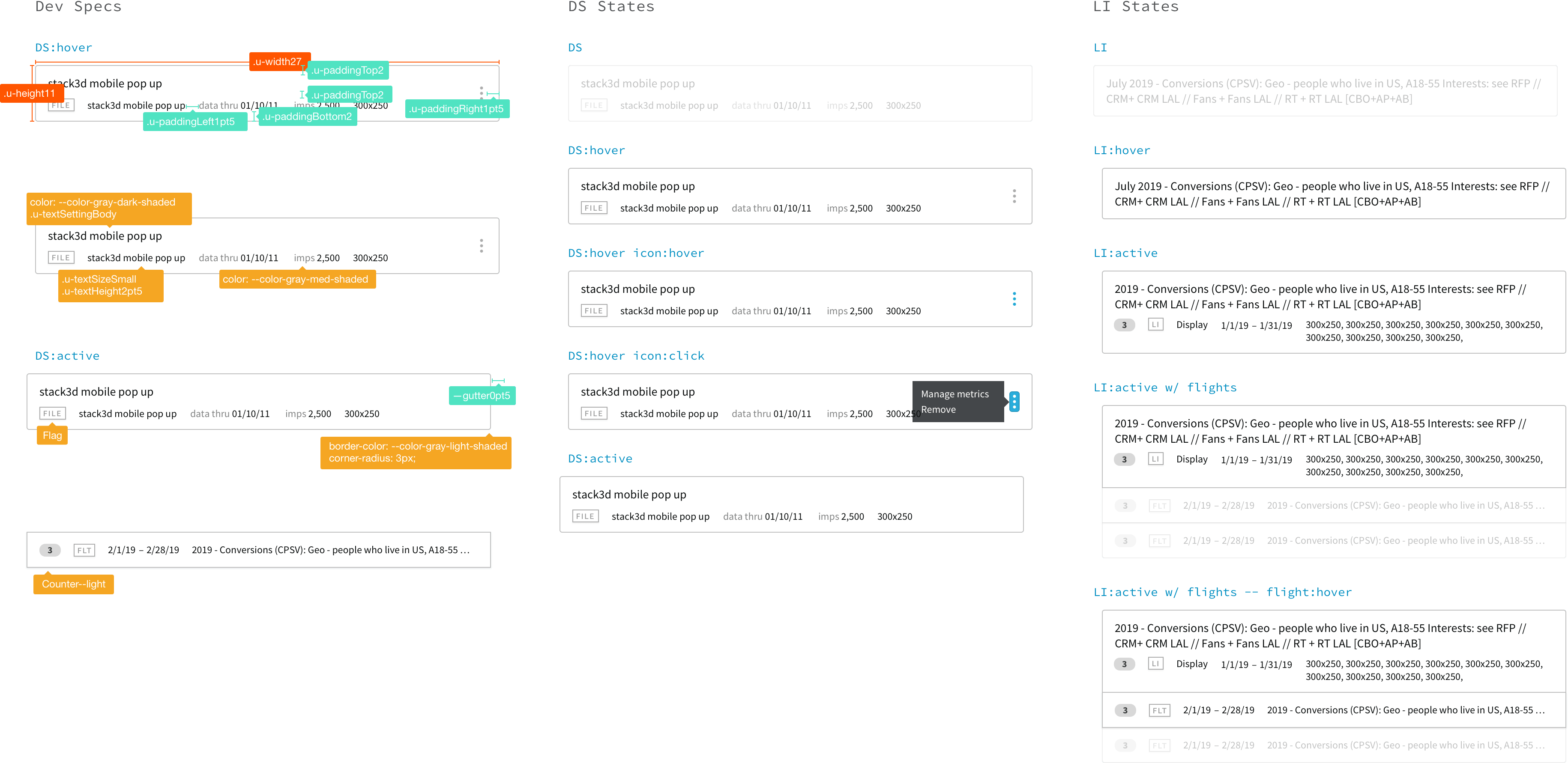
- There's too much extra information on the screen.
- It's hard to tell which data sources are mapped to which line items.
- Not being able to remove incorrect, redundant/duplicate data sources makes it hard to tell if you have selected the right thing.
- There's a lack of effective filtering options.
- Lack of bulk selection/actions takes longer.
- On average, errors occur 2–4 times a month and requires re-work.
Questions
Based on cross-functional discussion by product, development, and design, we posed the following questions:
- How can we make mapping faster and easier for people?
- How can we give people more confidence that they've completed their task correctly?
- Does differentiating more clearly between planning, configuration, and performance make sense to people who use this feature?
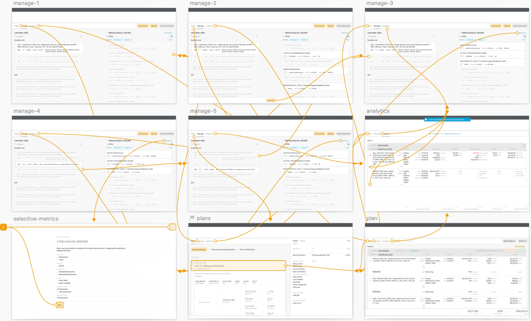
Then as the designer, I tried to create a design concept that would address our questions and top-findings in the best way possible. This included multiple concepts and rounds of feedback from the larger design team and results in something to share back with the cross-functional feature team.
At this stage I'm working quick and loose but with enough detail to communicate the key attributes of the idea, the general workflow, additional functionality in bullet points, and rationale behind design decisions.
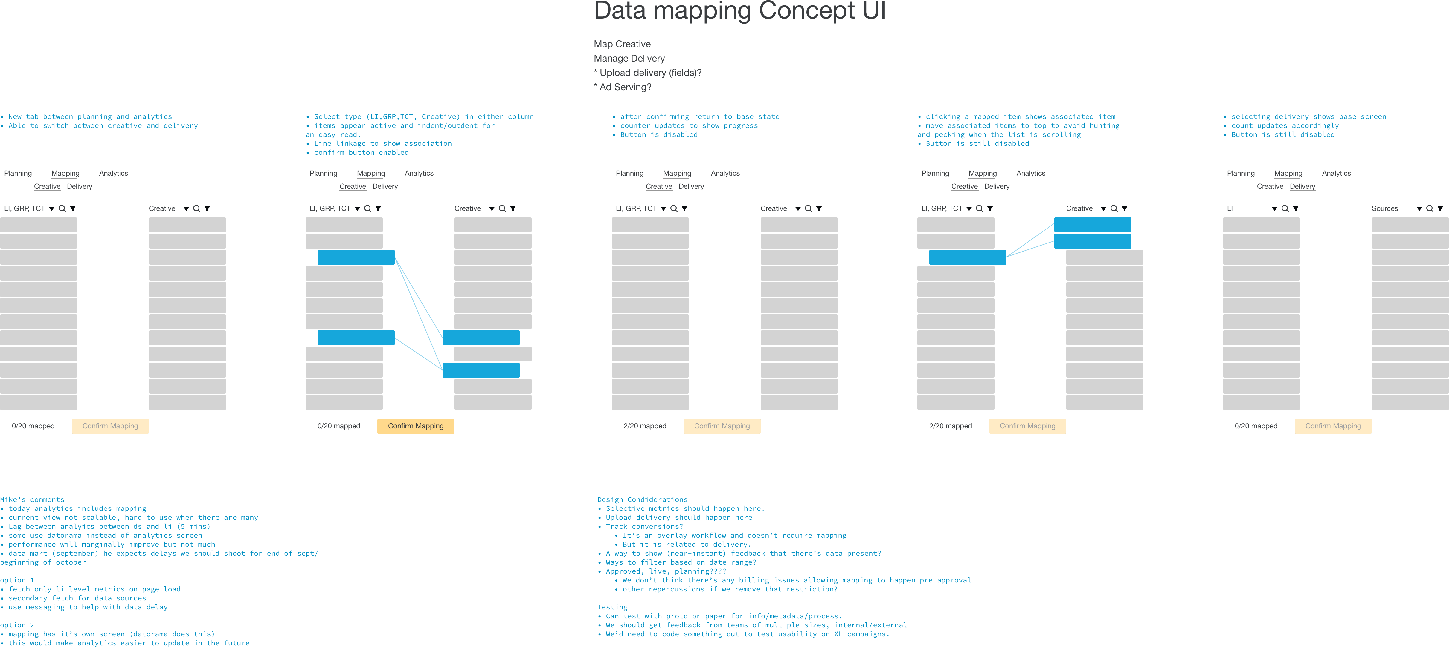
Our research showed that there was enough work involved with mapping that it could warrant a new view. A new view meant that we could reduce amount of meta-information for each item, and get more items on the screen at any one time. To more effectively communicate mapping status of the items on the screen, I added visual cues like indentation, linkage, or stateful color. When selecting an item on the left, an additional affordance would show mapped items grouped at the top of the right-side list, reducing scroll-time to determine what's been mapped.
Once the concept had been blessed by the cross-functional team, I made a lo-fi clickable prototype and ran it by the same people we talked to earlier.
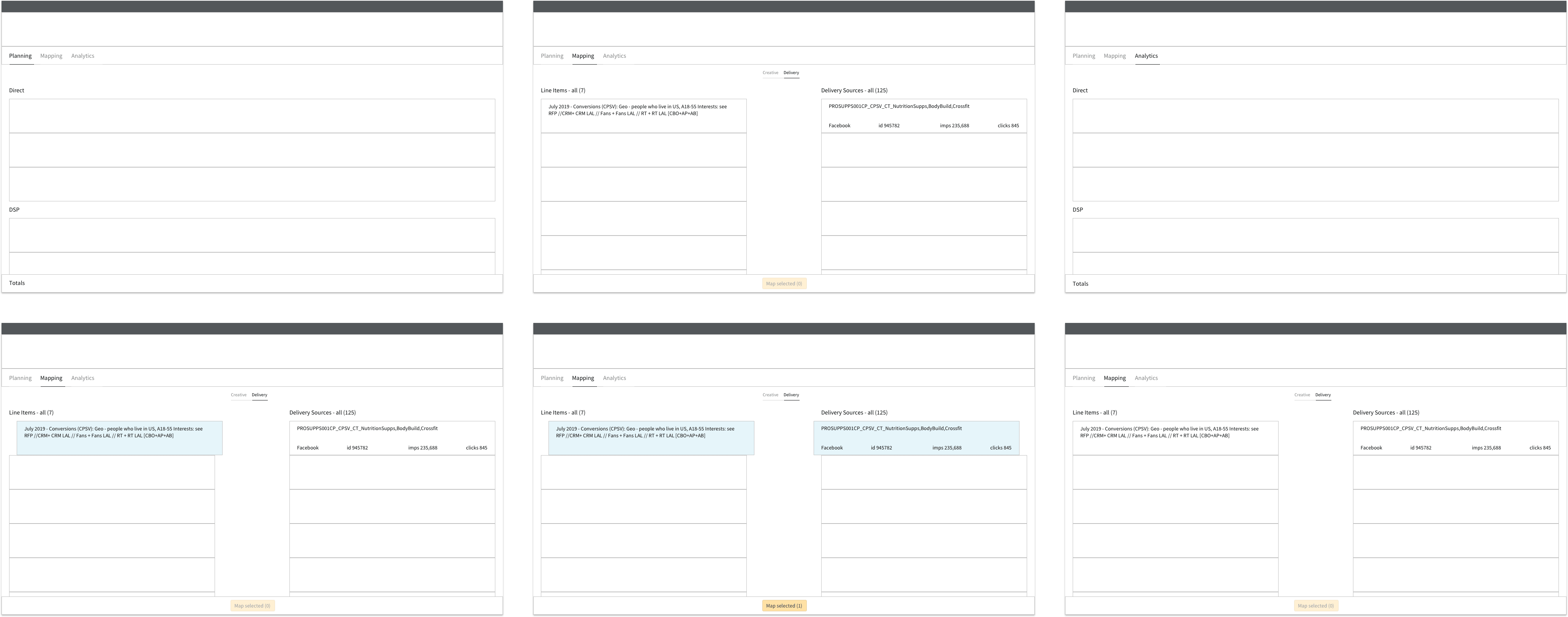
The feedback was pretty positive overall, with everyone liking mapping getting it's own view. Additionally, people liked the idea of reducing the amount of information on the screen, and that the visual changes were helpful. The questions came mostly for very specific functionality that was not accounted for intentionally.
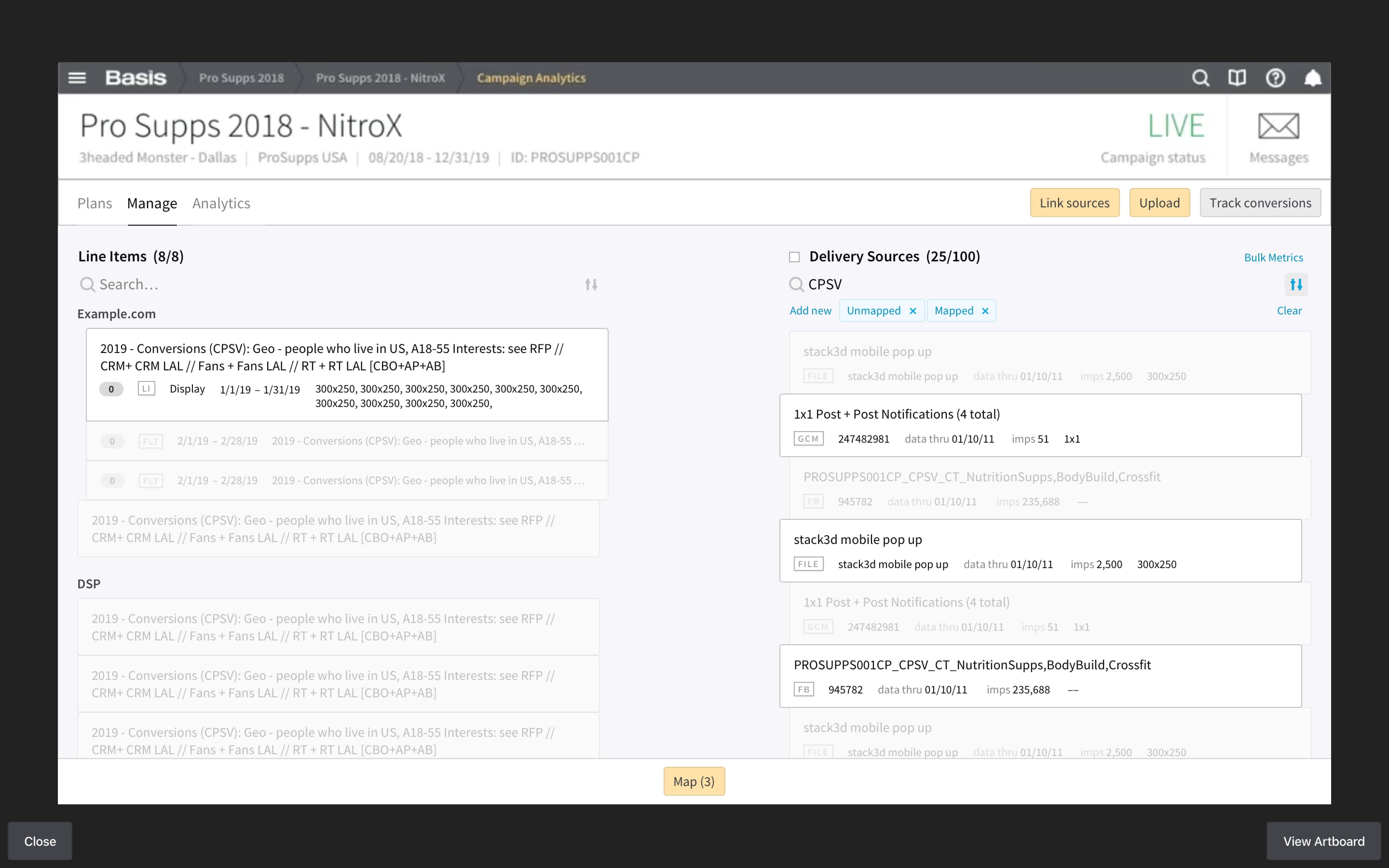
The next step was to address those concerns and nail down exactly what information is most useful to people who map, as well as filtering and bulk functionality to make the workflow more efficient.
Hypothesis
- We believe that by creating a dedicated mapping view (for creative and data sources) will enable AdOps and Media Specialists to be more productive and happier.
Experiment
- We can prove that hypothesis by building the new mapping view and A/B testing a large campaign against the original view.
Evidence
- We'll know we've been successful when time-on-task and mapping errors are both lower than to the original view.
- Another round of user interviews show an increase in positive qualitative feedback.
Iterate
- Implement any filtering or efficiency-related functionality beyond the basic that we become aware of while gathering feedback on our experiment.
- Widen scope to investigate whether creative mapping being co-located with mapping delivery also makes sense to our users.