The Brief
The team at Augustana had begun to feel like they were outgrowing their current site. They had noticed that a significant portion of their site’s traffic was mobile. They also wanted a highly customizable system that their internal staff could adapt and expand on their own. And their new site would have to impress and inform, equally, to an audience of parents, teens, faculty, and alumni.
The Process
To kick things off we flew to Sioux Falls for a few days of discovery. During these meetings we immersed ourselves in the lives of our clients. We identified pain-points, discussed technical aspects of the project, and gauged design sensibilities. We also participated with the client in exercises designed to document observations and insights, that we used to define our goals and priorities.
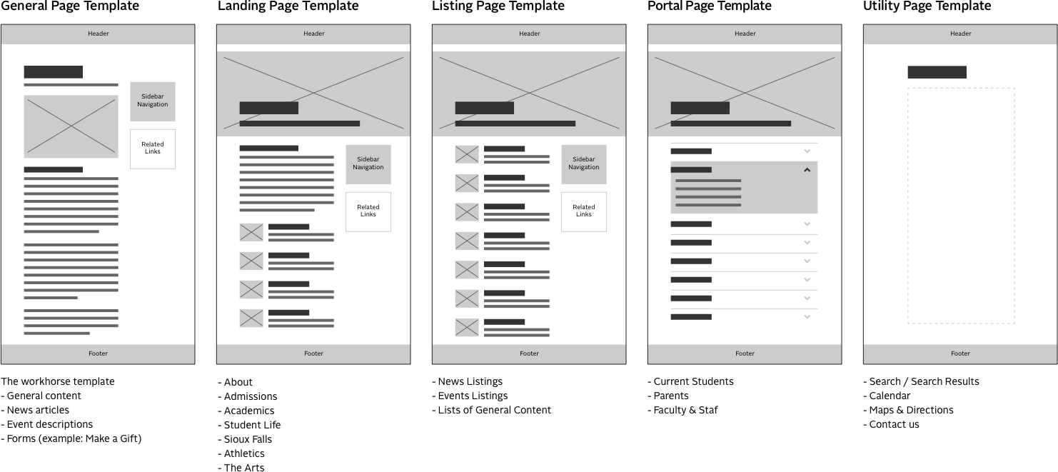
After discovery, I surveyed the current site’s content and developed a set of templates. I began by white-boarding, adding content to each template and mapping existing page types. I merged page types and found ways to reuse templates whenever possible. I noticed shared, repeatable parts and pieces emerging. These formed the building blocks of my design system.

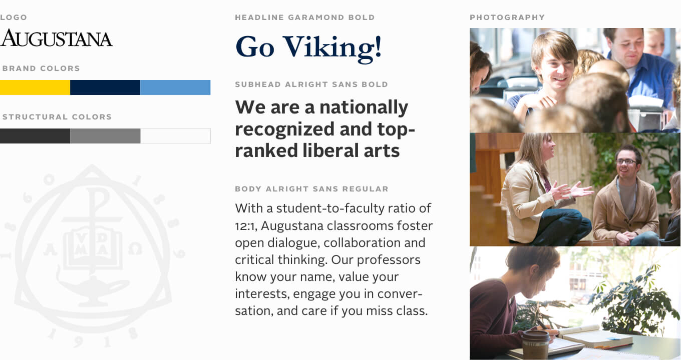
While addressing feedback on the templates, I began to think about visual design. I gathered existing assets that define the brand and explored combinations of logos, type, color, and photography. This was meant to be fast and loose so I could establish the visual language without having to draw pictures of websites.
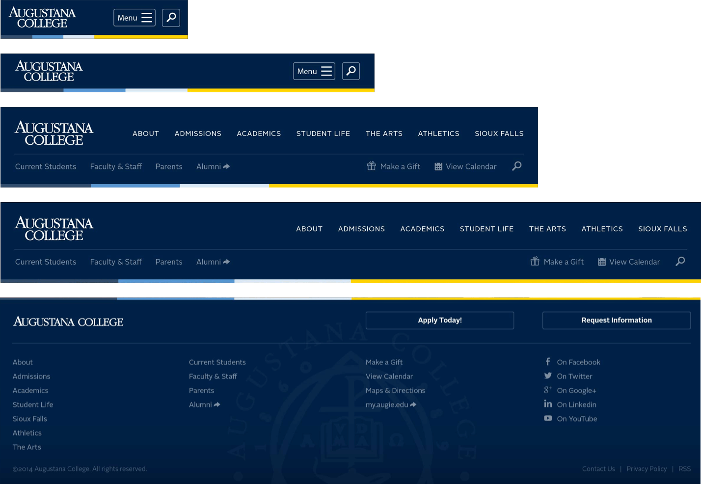
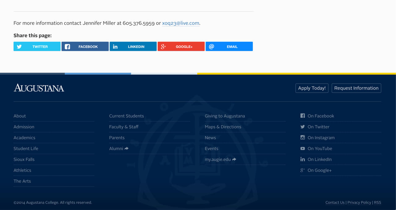
Next I used Sketch to explore some ideas and let the design process happen. First I worked up a homepage concept with a parallax scrolling technique, and then I experimented with the site's header and footer.
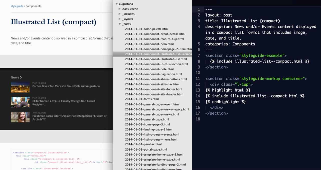
When I felt I had enough to go on, I took these initial ideas into code. I chose to use Jekyll because it already has the concepts of modular parts and pieces built right in and would allow me to work on components discretely and reuse them easily.
Because of these advantages, a style guide could be built with minimal effort in addition to the templates. It would document the entire system, reuse the same components populating the templates, live on Github Pages, and update with a push when changes were made. In fact, this is how we rolled the work out to the Augustana team.
I continued by creating new components, refining existing components, and working out the responsive behavior of the templates. By the end I had a fully flushed-out design system that was documented, styled, and ready for CMS development.
The Result
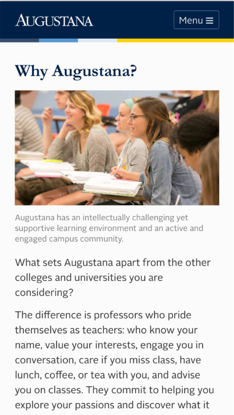
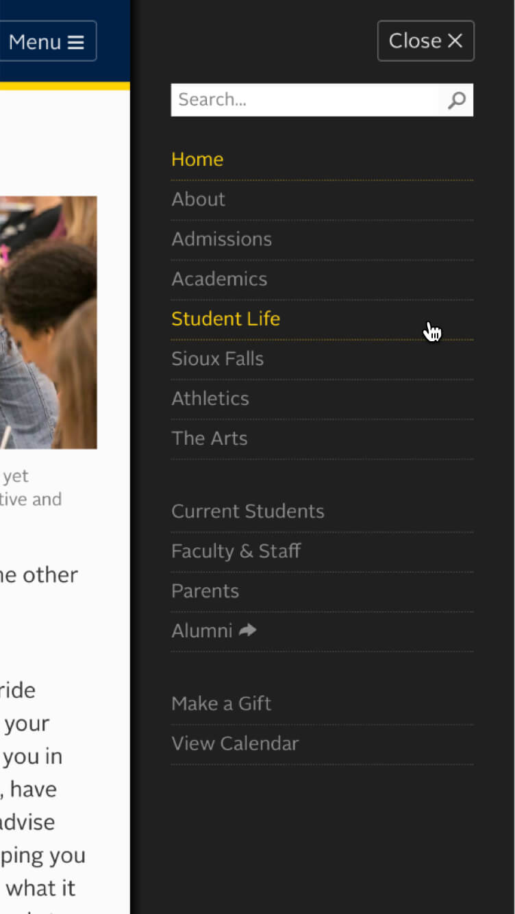
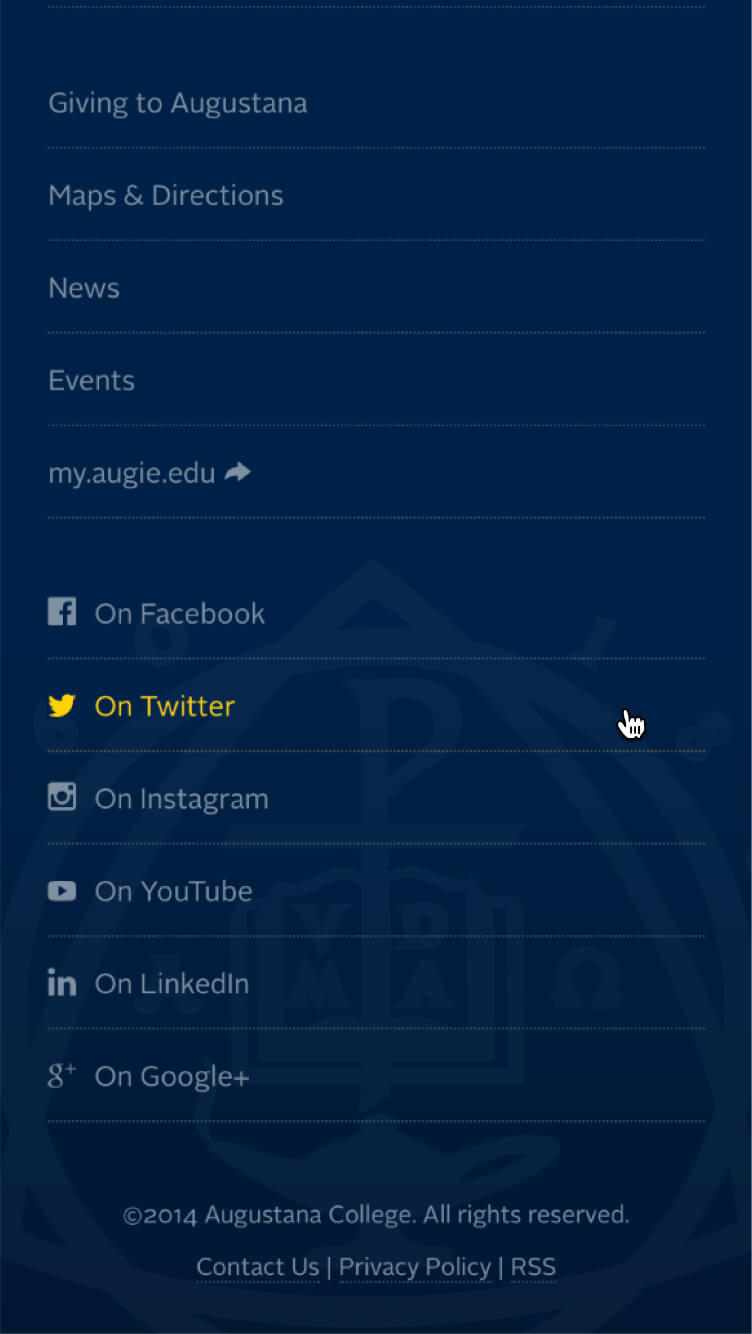
See how the design elements and components of the design gave form to the system's templates.
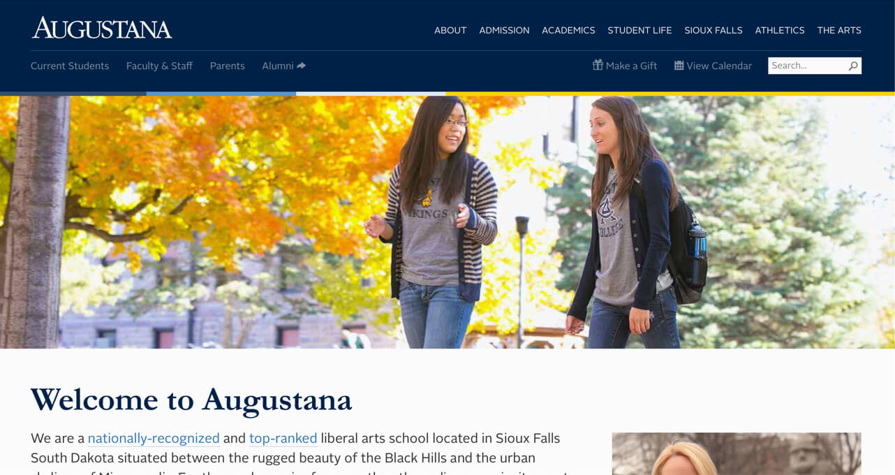
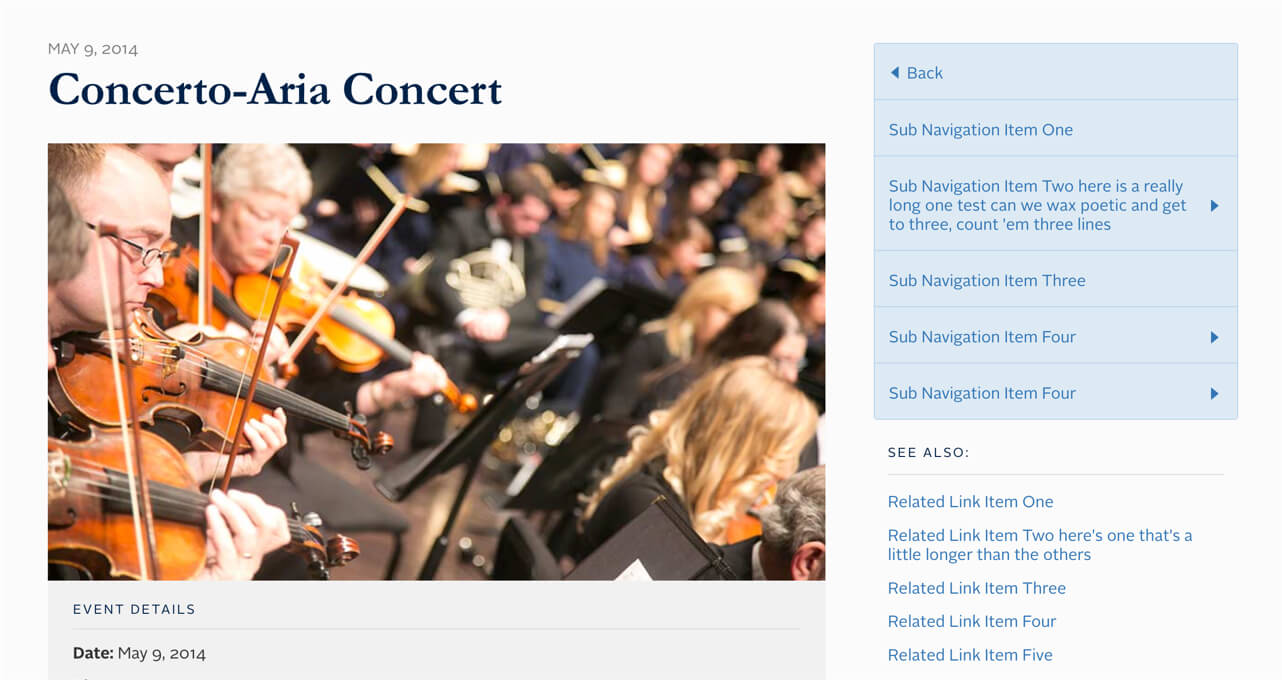
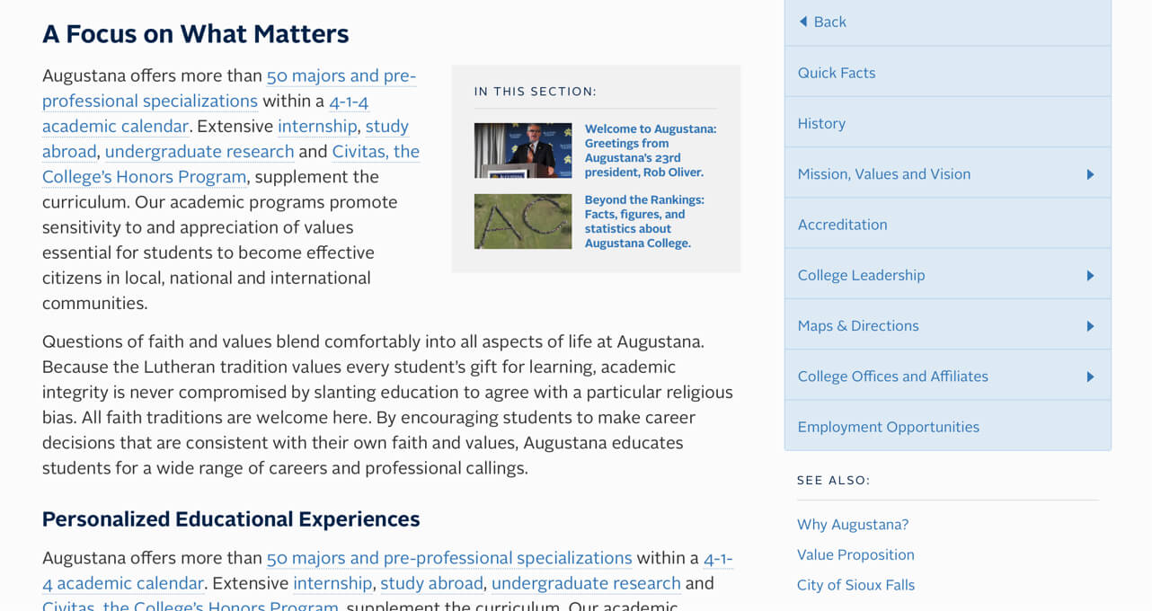
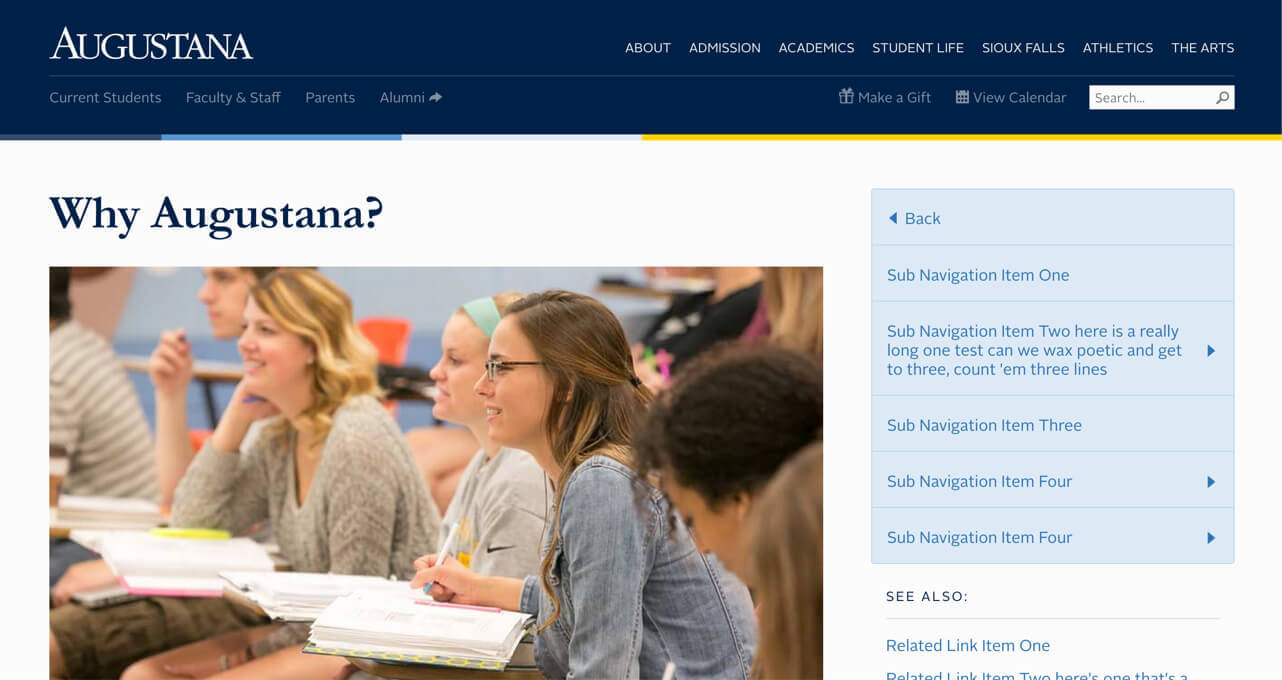
More about this project
Check out the style guide below to see everything that was designed for Augustana, including the in-browser prototypes like the parallax-scrolling homepage.