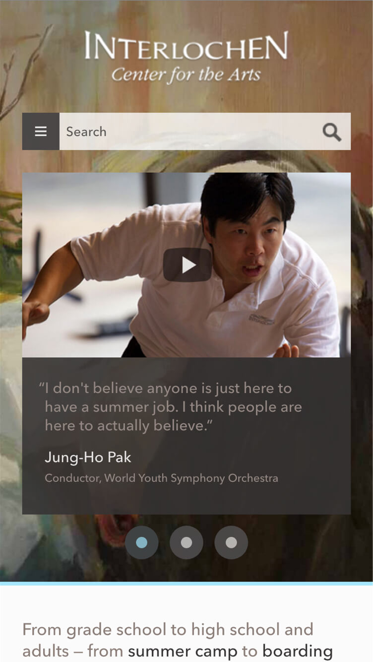
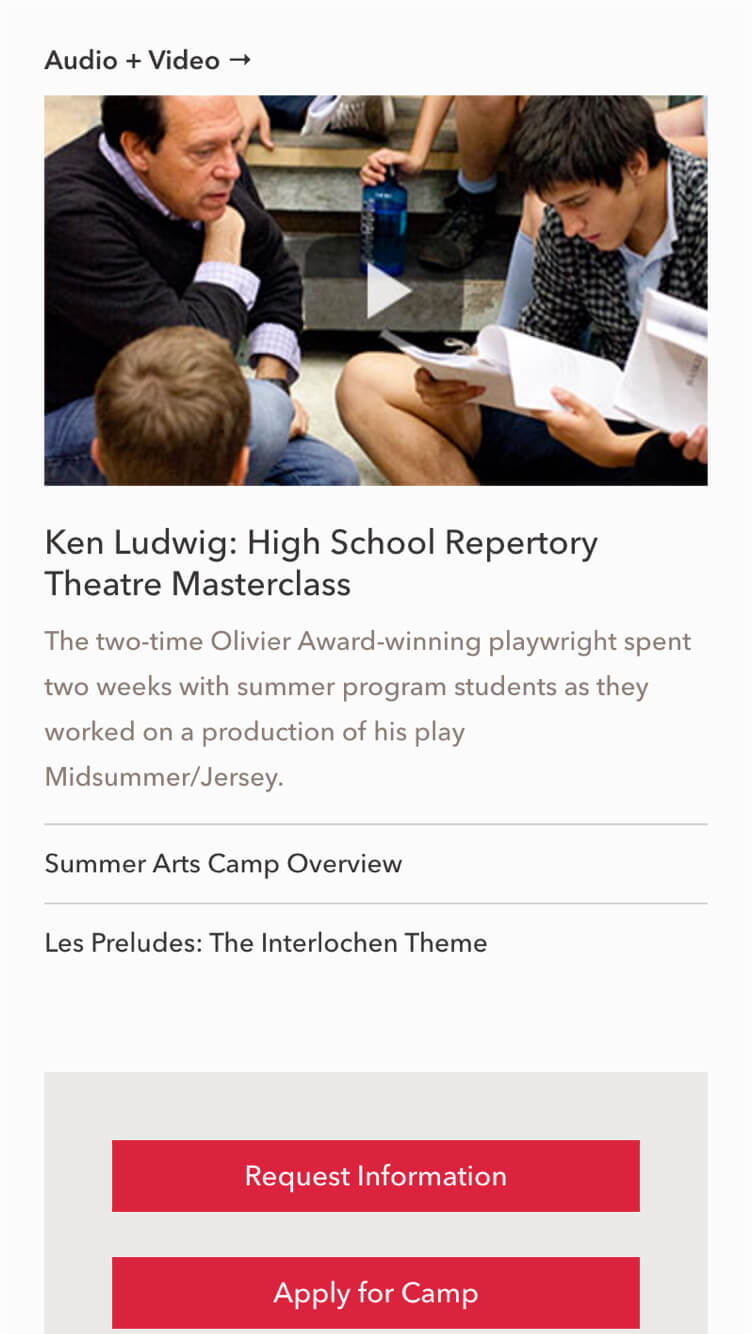
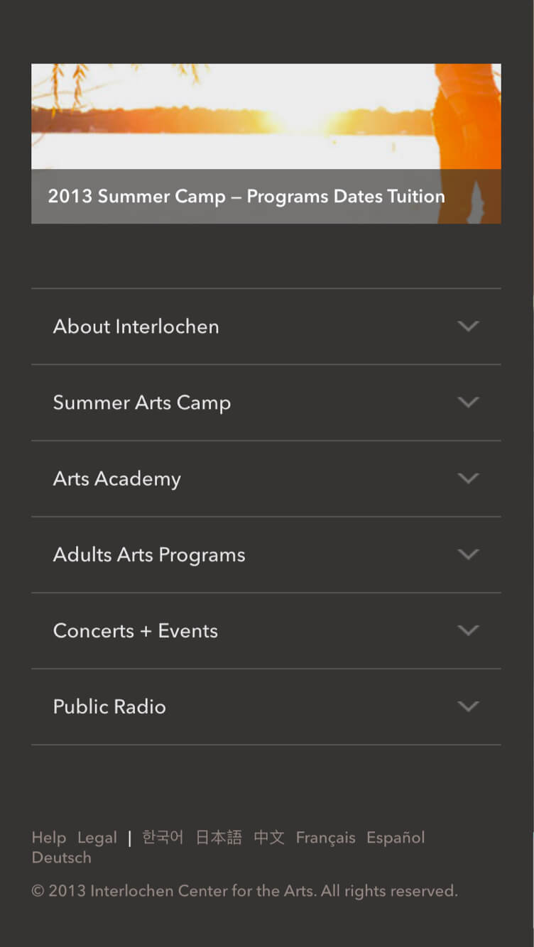
The Brief
Near the end of 2012 the Interlochen team began to think about upgrading to the newest version of the Drupal CMS. Since my company had worked with them previously, we were chosen to consult again. As an added value, we recommended they invest in a responsive design for a more sustainable, future-ready website.
The Process
We began the project by traveling to Interlochen, Michigan for a few days of discovery. While there we assessed our their needs and developed an overall approach to the project together. As the project’s designer, I gave an overview of RWD’s benefits and current limitations since it was still pretty early on in its adoption.
In addition to meeting our future teammates, the discovery sessions were also a great time to get a sense of this organization’s values and sensibilities, and how that bubbles through to their brand. In the case of Interlochen, it’s physical location in the heart of the Michigan woods left a deep impression on me.
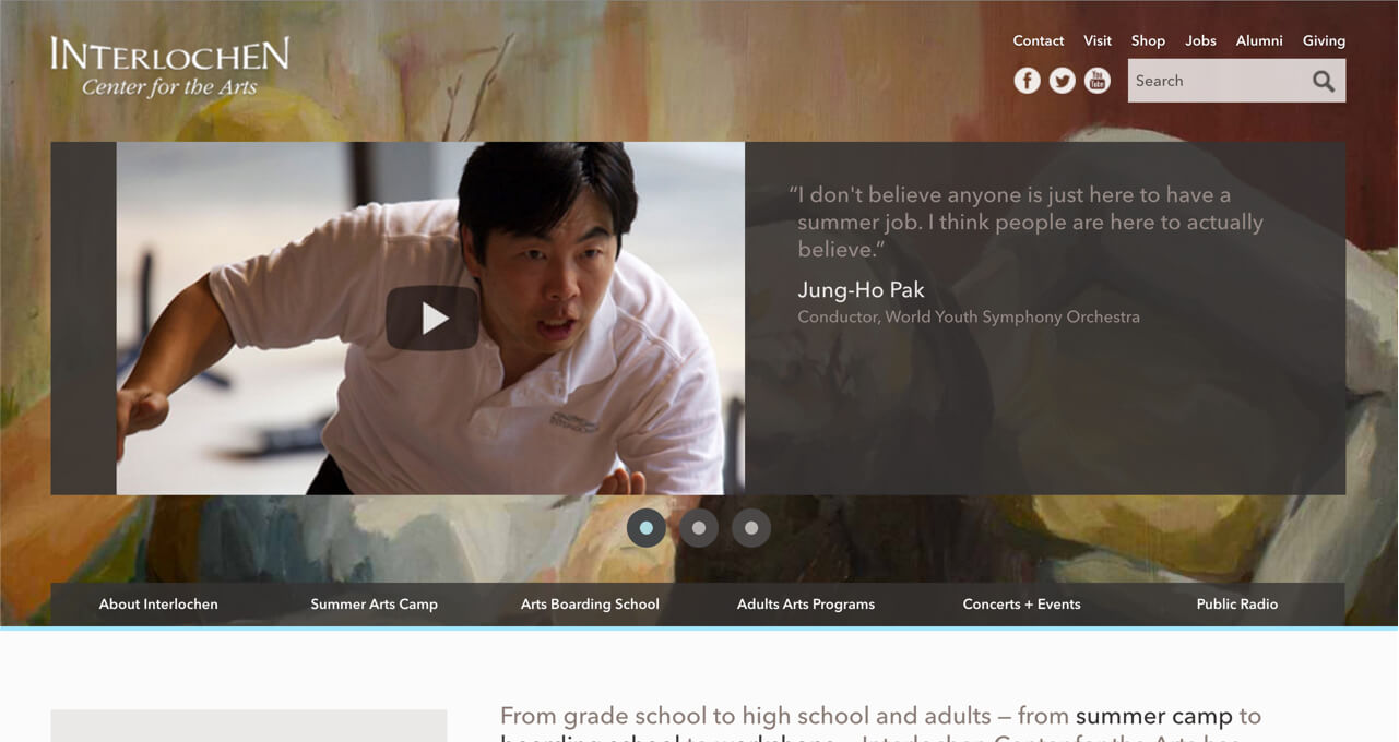
After discovery I began creating style tiles to communicate look-and-feel of a few different design directions. The beautiful woods of Interlochen inspired me to create a color palette of tree bark hues paired with imagery of the outdoor campus, students, and their artwork. The client loved this concept and we chose to move forward with it.
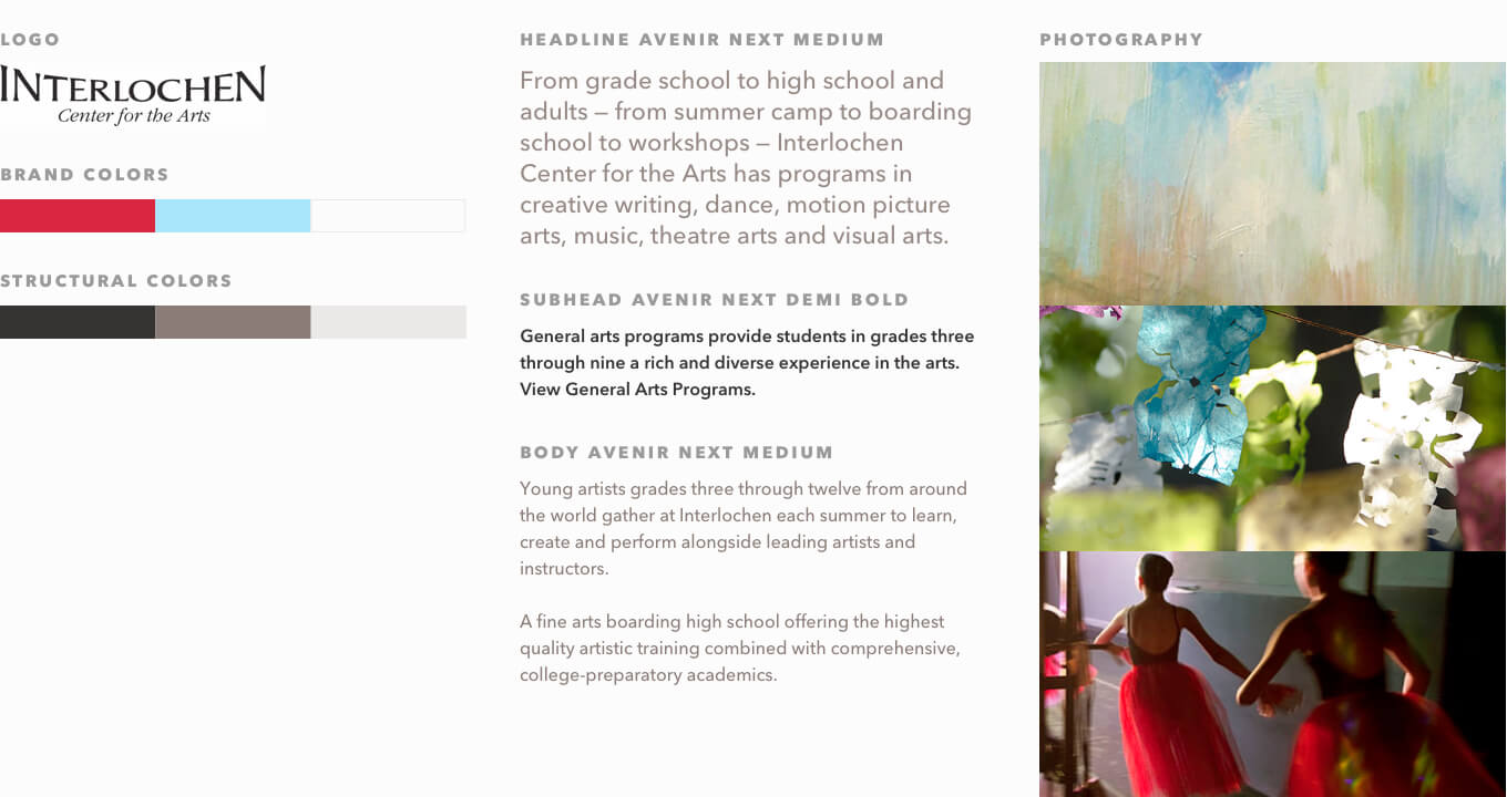
Next page templates were identified, and I used the chosen design direction to inform me as I began iterating with the client on a static page. As things began to firm up, I started coding a number of the page templates. This approach allowed me to precisely define the site’s styles and responsive behavior, and it also gave us head start on development.
The Result
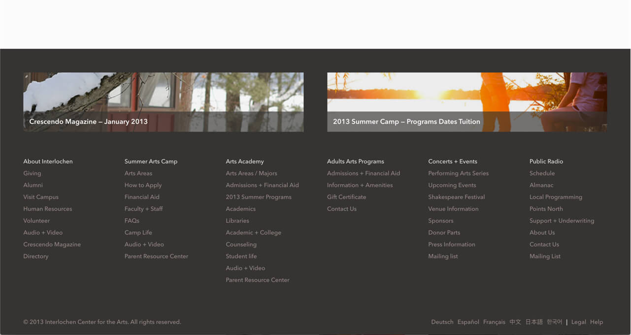
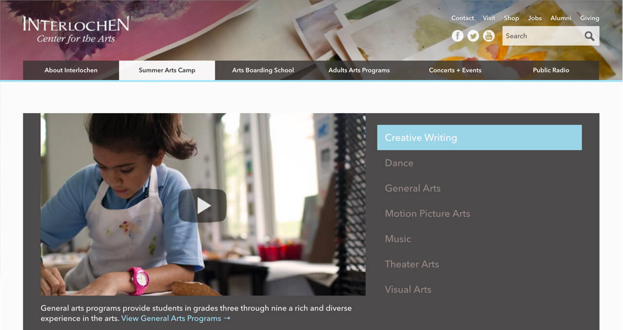
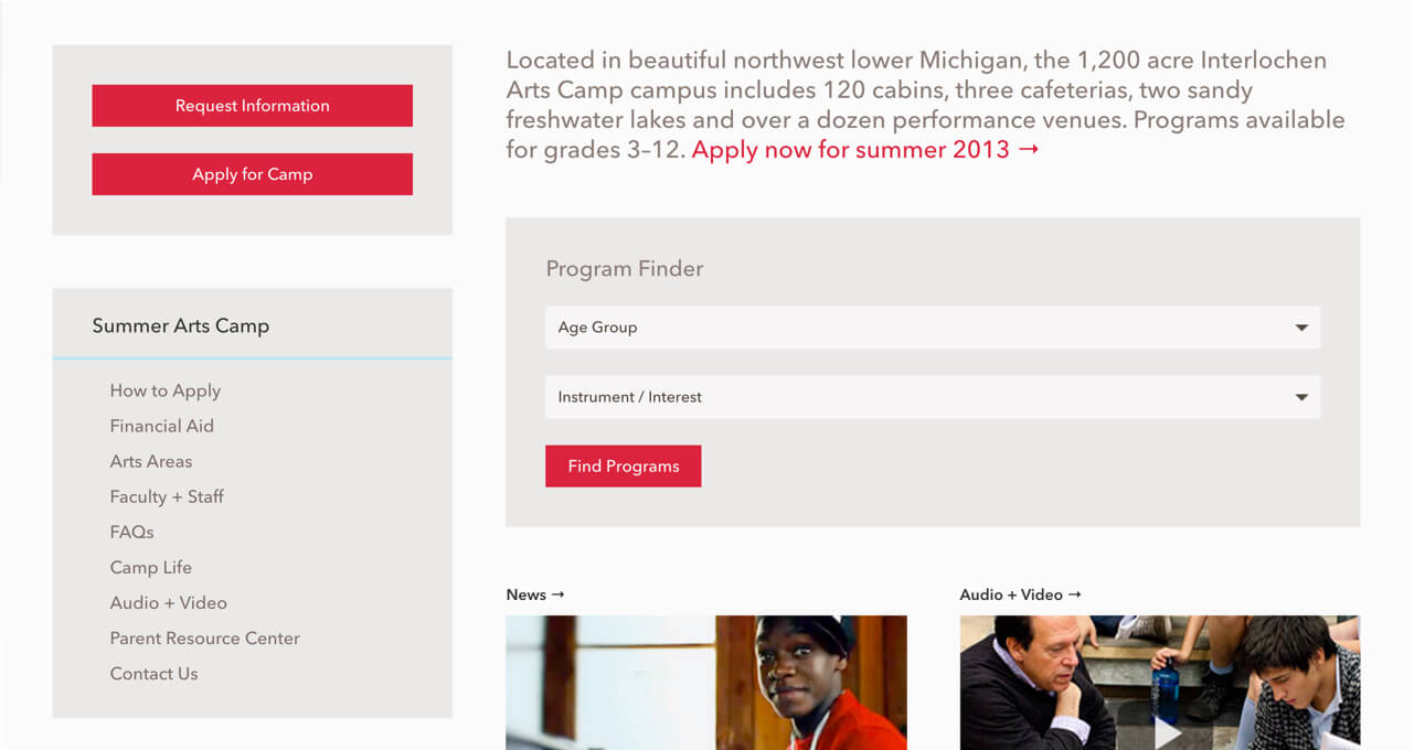
Below are some sample screens of the page templates that were created for the Interlochen redesign.
